 I make a lot of prospecting calls to tell people about my presentation design services and to ask for their business, so I hear many variations on “We don’t want any,” such as, “We already have a template,” “We do all of our PowerPoint in house,” and “My admin takes care of that.” Maybe you are thinking along the same lines as you read this. But sometimes it can be beneficial to look for a presentation design specialist outside one’s organization. Here are six good reasons why:
1. Your time is valuable.
Do you change the oil in your car? I don’t. Sure, I might save a few bucks doing it myself, but it’s much more convenient for me to bring the car to the shop. They perform this service all day every day and have developed work processes to speed things along quickly. Even a simple job like this might take me two hours, including finding all the proper tools, doing the actual work, and locating a place that will take the used oil.
If you don’t use PowerPoint all day every day, there are probably a few things that hold you up, that take a while to figure out. The thing is, every minute that you spend working with technology you’re not thoroughly familiar with is a minute you’re not making money for your company. You hire specialists for other business areas, why not presentation design?
2. Good design communicates ideas better than poor design.
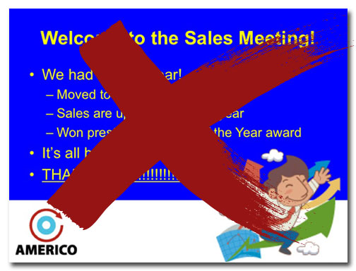
I’ve worked with a lot of people who are professionals in their respective careers. They are really good at what they do and they know their stuff, as is evidenced by the wealth of text and data they stuff into their presentations. But slides full of text, bullet points, busy charts, and complicated tables require an audience to spend too much time sorting through information and not enough time paying attention to the presenter. Even the best ideas get lost in the confusion.
Presentation designers can transform boring data into effective infographics, find and use photographs that do a better job of communicating than bullet points, and ensure that your deck looks like the rest of your marketing materials, thereby strengthening your brand.
3. You don’t want a bored audience.
How exciting is a slide full of text? It’s like watching paint dry, right? Loading up slides with text might make it easier to remember what to say, but it’s miserable for the audience. They’re too busy reading slides to listen to the presenter or, worse, they’re seething because they know how to read so they resent this huge waste of their time.
Do you think a roomful of irritated people will want to fund a venture? Buy a product or service? Attend a class? Probably not.
4. Designers have created the other components of your marketing mix.
Logos, websites, catalogs, data sheets, business cards, uniforms, vehicle graphics, brochures…these are all components of a company’s marketing mix. All of these were likely created by professional designers to create a cohesive brand. By using off-the-shelf PowerPoint templates and default colors, you introduce a jarring element that detracts from your brand and can make you look unprofessional.
5. Well-designed presentations make you look better prepared.
Presenters who read off of their slides are viewed as time-wasters who don’t know what they’re talking about. If you were presenting and the power suddenly went out, would you be able to continue? Do you know your presentation so well that you could keep talking? You should.
6. Other companies are doing it.
Smart companies invest in their marketing to create cohesive brands and messaging. Al Gore didn’t design his own slides for An Inconvenient Truth, they were created by a presentation design agency. And I’m guessing that Steve Jobs didn’t create his iconic presentations himself.
Professional presentation design gives you an edge over your competition. A presentation designer can create a stunning deck using the latest techniques of animation, video, and audio enhancement. The designer can also let you know when less is more.
Your turn
Do you create your own PowerPoint presentations or do you hire out? What about your keynote, annual meeting, and conference presentations?
