How many times have you heard “A picture’s worth a thousand words”? At least a billion, right? But how often do you put this maxim into practice? If you’re still trying to communicate difficult concepts in your presentations using lots of explanatory text, tables, and graphs, you may be overcomplicating your message. People don’t like reading dense blocks of text and loads of bullet points on a slide. Not only is it boring to read a presentation, it’s takes your attention off the presenter. What’s more, people tend to retain information longer when it’s presented as an image.
As explained in Wikipedia, according to the picture superiority effect, concepts are much more likely to be remembered experientially if they are presented as pictures rather than as words. That is, it’s easier for an audience to retain information shown as graphics. Let’s see how this works for PowerPoint
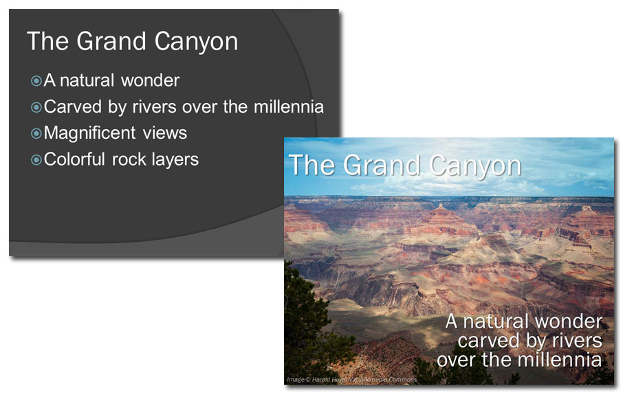
The uninspired slide on the left, though easy to read, is thoroughly unmemorable. On the redesigned slide the title stays the same but I dumped the two bullet points that describe the views and substituted this stunning picture (Image © Harald Hoyer via Wikimedia Commons). I also combined the remaining bullet points into one brief text block. People are going to remember this photo long after they forget those weak bullet points.
You can also use the picture superiority effect when creating instructional or training slides:
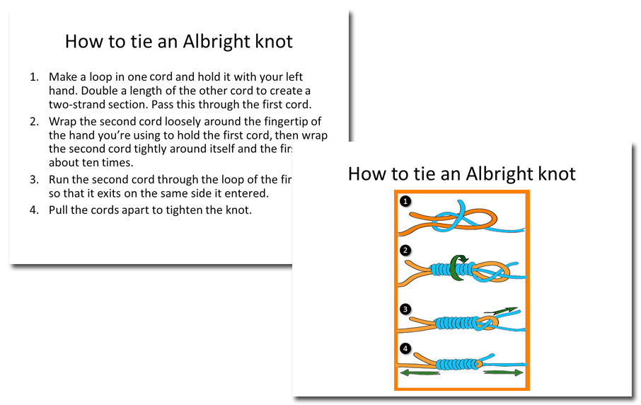
Have you ever tried to learn a new skill just by reading? Sure, it’s possible, but it’s much easier to follow a diagram, isn’t it? The slide on the left tells you everything you need to know when tying an Albright knot. The slide on the right shows you how to do it. See the difference?
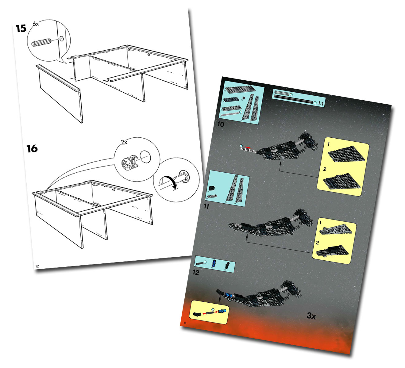
There are some companies that use pictograms very well to simplify complex instructions. IKEA and LEGO are two that spring to mind:
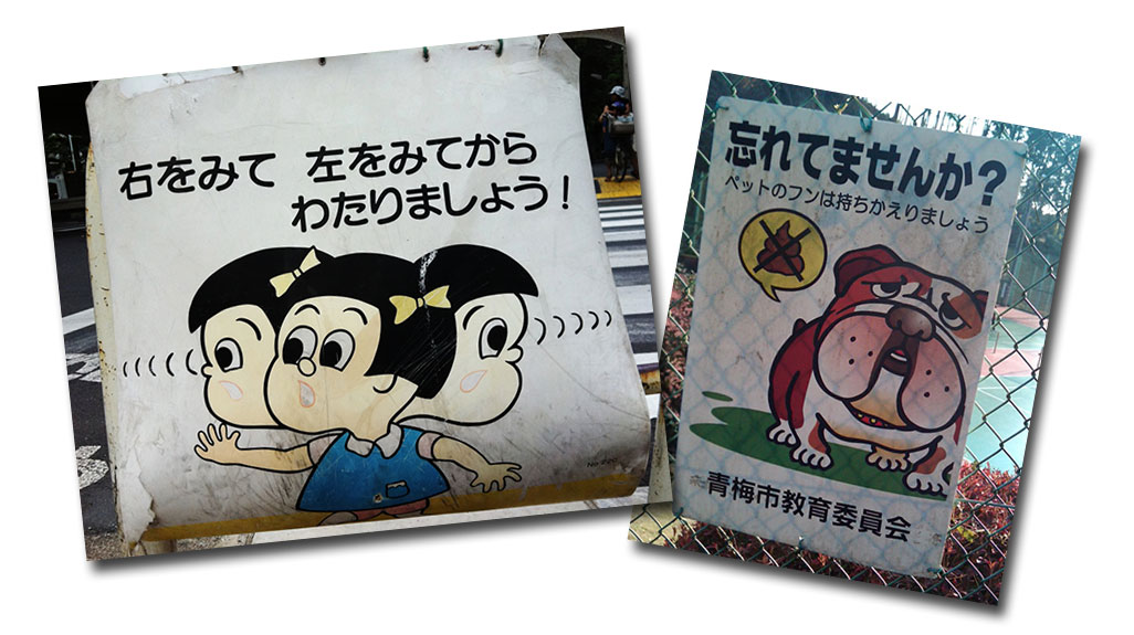
Pictures enable you to break the language barrier and be universally understood. Here are some more information graphics that use pictures to get the message across, courtesy of Clark Parker of thetokyofiles.com. Even if you don’t read Japanese, I’m sure the message of these signs will be crystal clear to you. My eight-year-old son understood what they meant right away!
Pictures immediately communicate ideas will help your audience to retain what you talk about. Try adding more pictures to your next presentation and see how people respond!


