PowerPoint makes it easy to create handouts, but the default style is one of the worst things you can give your audience. Here’s a better idea.
Default PowerPoint handout
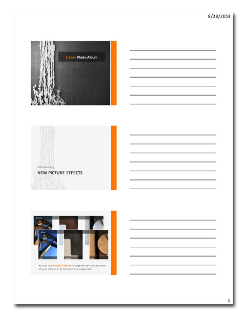
Here’s what the default PowerPoint handout looks like:
It seems helpful enough. This kind of handout shows an image of your slide with a space to write notes. But wait up! Before you go and print a hundred of these for your next big speech, consider this:
[highlight]This kind of handout is a huge waste of paper.[/highlight]
- Animated slides result in slide images that look like a many-layered mess.
- Decks that use full-screen pictures look great to the audience but are useless on handouts, since many of them may appear on-screen for only a few seconds.
- Presentations that have lots of animation and pictures contain lots of slides. Are all of them noteworthy? Probably not.
- Finally, let’s be honest. How many of this type of handout have you ever actually filled out and kept on file for future reference? Yeah, that’s what I thought.
A better kind of handout
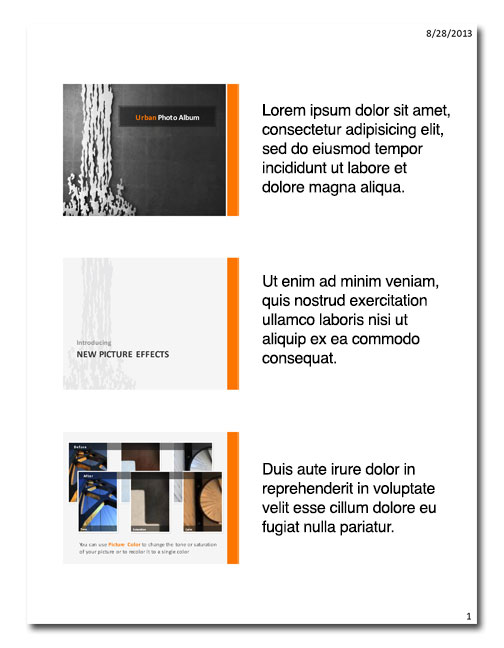
“But, Laura!” you say. “I’ve got to give my audience something!” OK, then, let’s take a look at another style of handout, one that includes the speaker notes.
Hmmm, this seems better. Let’s compare the benefits to the drawbacks of this kind of handout.
[raw]
[one_half] Benefits of Handouts [/one_half]
[one_half last] Drawback of Handouts [/one_half]
[clear]
[/raw]
[raw]
[one_half] Handouts eliminate the need to take notes. [/one_half]
[one_half last] You should encourage note-taking so that people can jot down things they find relevant. If they have a handout, it’s already done for them.[/one_half]
[clear]
[/raw]
[raw]
[one_half] Handouts provide a reference during your presentation. [/one_half]
[one_half last] …which your audience will be ignoring if you distribute them when they arrive. They’ll be too busy flipping through their handouts to pay attention to you. [/one_half]
[clear]
[/raw]
[raw]
[one_half] Handouts can be referred to long after your speech is over. [/one_half]
[one_half last] Again, how many handouts do you have on file that you actually go back to? I’m willing to bet it’s not a large number. [/one_half]
[clear]
[/raw]
The best kind of handout
“All right, now you’re just being negative!” I can hear you saying now. “What are we supposed to give our attendees, anyway?” You should give them the best kind of handout: a brief summary of your main talking points that provides ways to continue the conversation.
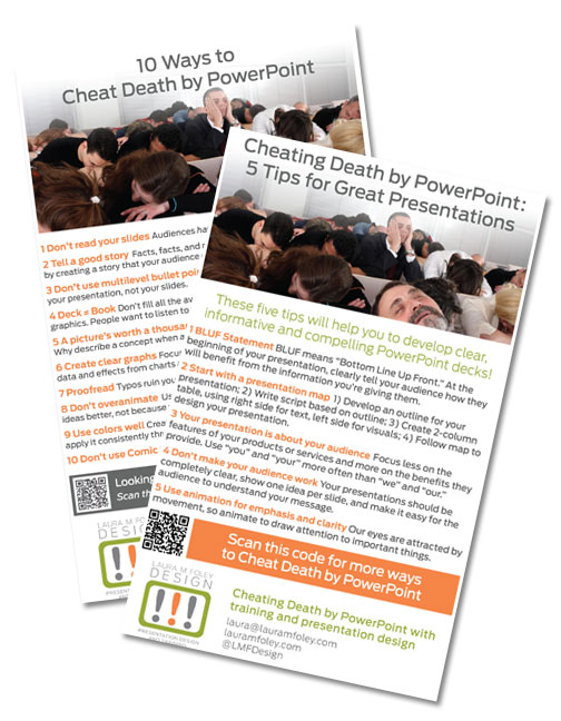
 Here’s a picture of some handouts that I distribute at my presentations. What makes them the best kind of handout?
- They have titles: The titles clearly state the contents of the handout.
- They are branded: From the image to the typeface to the colors to the logo, these handouts have all of the brand elements of Laura M. Foley Design.
- They look alike: Handouts are marketing collateral. As such, they should look like they all come from the same company.
- They cover the highlights: Providing the entire script of your presentation can be overkill. By showcasing your main talking points, you provide a good summary of what you want people to remember.
- They are interactive: There’s a QR code that people can scan which brings them to my website.
- They provide contact information: I give people three ways to get in touch with me: my email address, website URL, and Twitter handle.
It’s not hard to create this type of handout; you can do it in PowerPoint. Save them as PDF files and have them professionally printed for handouts that do what they’re supposed to: be helpful and allow future interaction.
Your Turn
What types of handouts have you found to be the most effective?


