Good typography is one way of telling whose deck was designed by a professional presentation designer and which one was done by a nondesigner. Sometimes the changes the professional makes are so subtle that you don't even notice that they're there, but when you compare the decks side-by-side it's … [Read more...] about Good PowerPoint Design: Typography and avoiding orphans
How be a better presenter by manipulating data
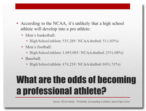
There are ways to show data to make them more compelling and there are ways to use data to put an audience to sleep. Unfortunately, since it's much easier to present data as a bullet-pointed outline or a table, many presenters opt for the latter. In PowerPoint as in life, the easy route is often not … [Read more...] about How be a better presenter by manipulating data
How much text on a slide is too much?
It's surprising how many presenters equate loads of text on a slide with effective information transfer. Some people believe that if they include every last scrap of data on the subject they're presenting that their audience will become as knowledgeable as they are. News flash: it doesn't … [Read more...] about How much text on a slide is too much?


