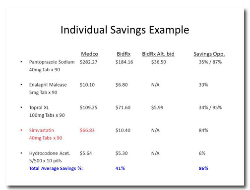
This month's slide comes from Design Dispatch subscriber Bob Carpenter of BidRx. His company wants to become the eBay or the Priceline of the pharmaceutical business. By logging on to BidRx, people will be able to get competitive pricing on their prescription medicine and save a bundle in the … [Read more...] about March Slide Makeover of the Month
February Slide Makeover of the Month
With February comes Valentine's Day so I thought I'd draw inspiration from William Shakespeare to address a common problem in slide layout: How do you format a quotation? Before Snore. Apart from the pleasant background color and graphics, this quotation is about as florid as a wet dishrag. This … [Read more...] about February Slide Makeover of the Month
January Slide Makeover of the Month
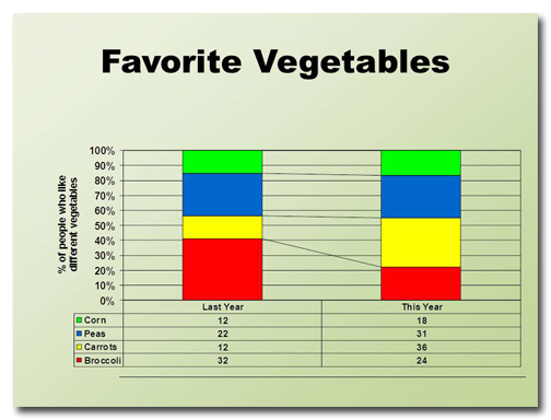
This month's slide was adapted from a real presentation I worked on in December. So as not to reveal proprietary information, the data have been changed but the slide layout is essentially the same. Before This slide took me a little while to figure out. I can tell that the four data points are … [Read more...] about January Slide Makeover of the Month
Ready, Fire, Aim! The wrong way to design a PowerPoint deck
I once got a call from a woman who wanted some PowerPoint advice. She said something along the lines of, "Well, I've finished all the slides, now I need to work on my script." "You fool!" I wanted to shout. "You've done it backwards! Throw it away and start all over again!" Then I pictured myself … [Read more...] about Ready, Fire, Aim! The wrong way to design a PowerPoint deck
December Slide Makeover of the Month
This month's slide comes from a real presentation that a colleague of mine sat through. The image and text have been changed to protect the identity of the presenter, but it's essentially the same slide from the deck. Before Wow. This slide has it all: a tiny title, densely packed text, … [Read more...] about December Slide Makeover of the Month
November Slide Makeover of the Month
November's slide comes from a company that specializes in indoor environmental quality. The message of the slide was that they could make some definite improvements on the level of service they were providing to their customers. Before This slide has a lot of information on it; too much to absorb … [Read more...] about November Slide Makeover of the Month
October Slide Makeover of the Month
October's slide makeover is from a deck I found on SlideShare. There's a lot to do on this bad boy, so let's get started. Before Ever hear of the "Adkins" Diet? Neither had I. The person who created this slide misspelled "Atkins" four times! If your audience is focusing on your typos and not your … [Read more...] about October Slide Makeover of the Month
September Slide Makeover of the Month
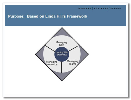
This month's slide makeover is from a deck I redesigned for Ellen Wingard of Ellen Wingard and Associates. She was leading a daylong workshop at the Harvard Business School and her presentation combined her own approach to management training with that of Linda Hill, a respected HBS … [Read more...] about September Slide Makeover of the Month
