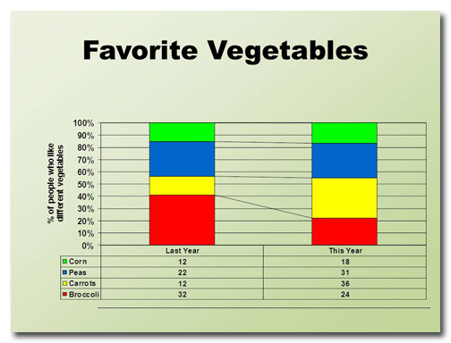
This month's slide was adapted from a real presentation I worked on in December. So as not to reveal proprietary information, the data have been changed but the slide layout is essentially the same. Before This slide took me a little while to figure out. I can tell that the four data points are … [Read more...] about January Slide Makeover of the Month
PowerPoint vs. Prezi: Which is better?
Throughout history, there have been many great rivalries: Red Sox vs. Yankees, Coke vs. Pepsi, Mac vs. PC. In the battle for the hearts and minds of the presentation community, perhaps there is no greater clash than PowerPoint vs. Prezi. Up-and-comer Prezi brings its A-game to the fight. It's … [Read more...] about PowerPoint vs. Prezi: Which is better?
Ready, Fire, Aim! The wrong way to design a PowerPoint deck
I once got a call from a woman who wanted some PowerPoint advice. She said something along the lines of, "Well, I've finished all the slides, now I need to work on my script." "You fool!" I wanted to shout. "You've done it backwards! Throw it away and start all over again!" Then I pictured myself … [Read more...] about Ready, Fire, Aim! The wrong way to design a PowerPoint deck
December Slide Makeover of the Month
This month's slide comes from a real presentation that a colleague of mine sat through. The image and text have been changed to protect the identity of the presenter, but it's essentially the same slide from the deck. Before Wow. This slide has it all: a tiny title, densely packed text, … [Read more...] about December Slide Makeover of the Month
Animation in PowerPoint: too cool or too much?
After presenting my Cheating Death by PowerPoint workshop, I often ask people how they liked the animation. They usually answer "What animation?" Rather than feel discouraged that all that work I put into my deck went unnoticed, I'm overjoyed that the animation was so seamlessly integrated into the … [Read more...] about Animation in PowerPoint: too cool or too much?
November Slide Makeover of the Month
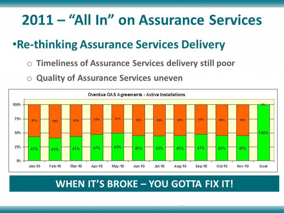
November's slide comes from a company that specializes in indoor environmental quality. The message of the slide was that they could make some definite improvements on the level of service they were providing to their customers. Before This slide has a lot of information on it; too much to absorb … [Read more...] about November Slide Makeover of the Month
October Slide Makeover of the Month
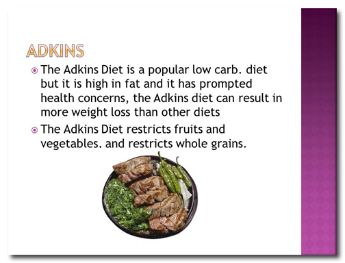
October's slide makeover is from a deck I found on SlideShare. There's a lot to do on this bad boy, so let's get started. Before Ever hear of the "Adkins" Diet? Neither had I. The person who created this slide misspelled "Atkins" four times! If your audience is focusing on your typos and not your … [Read more...] about October Slide Makeover of the Month
How much text on a slide is too much?
It's surprising how many presenters equate loads of text on a slide with effective information transfer. Some people believe that if they include every last scrap of data on the subject they're presenting that their audience will become as knowledgeable as they are. News flash: it doesn't … [Read more...] about How much text on a slide is too much?
