Have you noticed how sales people and marketing people often don't get along? Each camp complains that the other guys are creating needless work for them, undermining their efforts, don't understand their value to the company, etc., etc., etc. Why can't they see that they should work together to … [Read more...] about Sales vs. Marketing: A tale of two PowerPoints
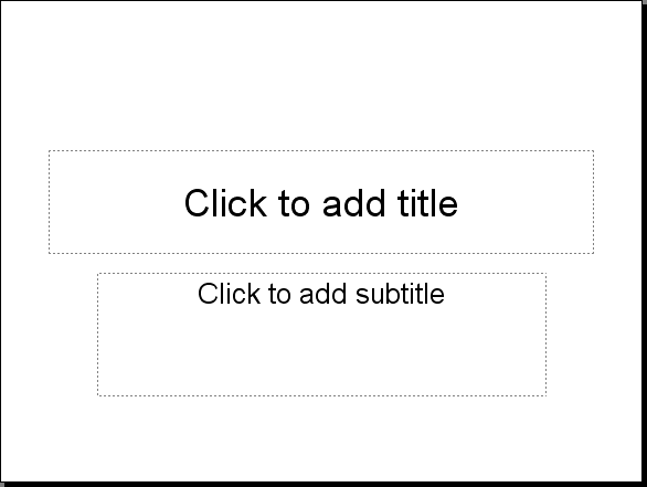
How to create an effective title slide in PowerPoint
You've sweated out the details of your presentation. You've labored over your PowerPoint deck, writing, rewriting, and editing until your key messages shine through. You're ready. But are you really? Presenters often overlook a valuable opportunity to connect with their audience: their title … [Read more...] about How to create an effective title slide in PowerPoint
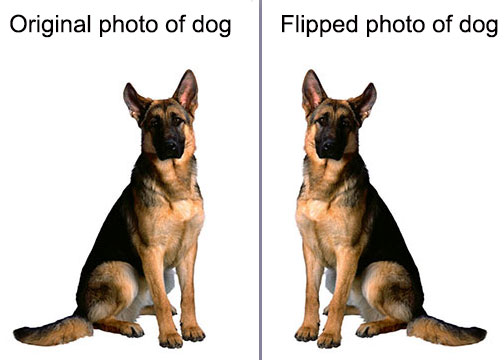
PowerPoint vs. Photoshop: Making pictures better by flipping them
Photoshop is the number-one tool used by professional designers for photo manipulation. But you don't need Photoshop to do some incredible things with pictures for PowerPoint. And in this article I'm going to show you how to flip objects. When you flip an object, you create a mirror image of it … [Read more...] about PowerPoint vs. Photoshop: Making pictures better by flipping them
How do you tell a story in PowerPoint?
Storytelling is not a new way of communicating ideas. In fact, people have been telling stories since the beginning of recorded history. Why do stories like the tale of Gilgamesh, the fable of the fox and the grapes, and the saga of Jason and the Argonauts continue to be enjoyed today? Because … [Read more...] about How do you tell a story in PowerPoint?
PowerPoint vs. Photoshop: How to crop photos
Everyone knows that Photoshop is the most powerful software available for manipulating photographs. But Photoshop is an insanely complicated program to master. I've been using it for over twenty years and I only use about half of its capabilities. It might seem that all hope is lost for the average … [Read more...] about PowerPoint vs. Photoshop: How to crop photos
Good PowerPoint Design: Typography and avoiding orphans
Good typography is one way of telling whose deck was designed by a professional presentation designer and which one was done by a nondesigner. Sometimes the changes the professional makes are so subtle that you don't even notice that they're there, but when you compare the decks side-by-side it's … [Read more...] about Good PowerPoint Design: Typography and avoiding orphans
How to be a crappy presenter
Sometimes it seems like people go out of their way to be terrible at giving presentations. It's almost as if they follow these ten steps to being awful: 1. Show up at the last minute. To ensure that your audience realizes from the start that you are a crappy presenter, you should make it a … [Read more...] about How to be a crappy presenter
PowerPoint Cheat Sheet: 5 Essential production tricks
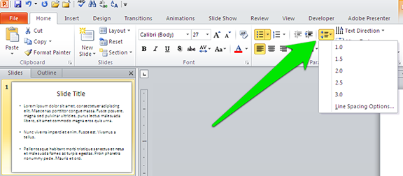
During a recent one-on-one PowerPoint training session, my client asked me how to make two lines of text fit onto one line. I quickly clicked on an icon and made some changes, causing the text to pop into place. "Whoa, whoa, whoa, what did you just do there?" the client asked. So I undid the … [Read more...] about PowerPoint Cheat Sheet: 5 Essential production tricks


