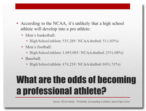
There are ways to show data to make them more compelling and there are ways to use data to put an audience to sleep. Unfortunately, since it's much easier to present data as a bullet-pointed outline or a table, many presenters opt for the latter. In PowerPoint as in life, the easy route is often not … [Read more...] about How be a better presenter by manipulating data
You don’t need to number your PowerPoint slides. Discuss.
People often ask me to work with PowerPoint templates that include slide numbers. I can't imagine why slide numbers would be important. Maybe it makes presenters feel like they're accomplishing something if they glance at the screen and see that they're on slide 92, I don't know. But putting slide … [Read more...] about You don’t need to number your PowerPoint slides. Discuss.
Should my logo be on each PowerPoint slide? No.
Now, I know you're probably thinking along one of these lines: "We paid a lot of money for that logo, and I want people to see it!" "I'm reinforcing my company's brand by showing my logo on each slide." "That's the way our template was designed." I would counter that if you start and end … [Read more...] about Should my logo be on each PowerPoint slide? No.
How much text on a slide is too much?
It's surprising how many presenters equate loads of text on a slide with effective information transfer. Some people believe that if they include every last scrap of data on the subject they're presenting that their audience will become as knowledgeable as they are. News flash: it doesn't … [Read more...] about How much text on a slide is too much?


