Some presenters believe that by loading their decks with text, bullet points, data, complex graphs, and dense tables they are helping their audience to understand their message. Nothing could be further from the truth. The problem: Complexity Slides like these are all to common: Note: This … [Read more...] about Why simple PowerPoint presentations are best
PowerPoint tables: How to simplify your presentations
In January 2014 I wrote about the top 5 top PowerPoint resolutions you should make for the new year. One of these was to avoid complex tables because they make the audience work too hard to understand what's on the slide. Because tables contain mostly text and numbers, not only do people need to … [Read more...] about PowerPoint tables: How to simplify your presentations
Who are the best PowerPoint designers and trainers?
Several years ago at a design conference, I announced my decision to focus my business on PowerPoint design and training. I received many types of reactions, none of them supportive. Some designers laughed at me, saying that they hated PowerPoint so much that they wouldn't take on PowerPoint … [Read more...] about Who are the best PowerPoint designers and trainers?
How can we learn from Michael Bay’s CES blunder?
To say that the Consumer Electronics Show, or CES, is an electronics and technology trade show is like saying that a 1954 Château Lafite Rothschild is a bottle of wine. It is that and so much more. It is a huge deal and presenters who are introducing new products do whatever it takes to make a great … [Read more...] about How can we learn from Michael Bay’s CES blunder?
5 top PowerPoint New Year’s resolutions for 2014
Happy New Year! It's the time of year when we reflect upon what we've done with ourselves personally and professionally over the past year and resolve to become better people. Maybe there's a new habit you want to develop (Exercise more! Drink less soda! Stop wearing fleece pants and slippers to the … [Read more...] about 5 top PowerPoint New Year’s resolutions for 2014
What’s the best kind of PowerPoint handout?
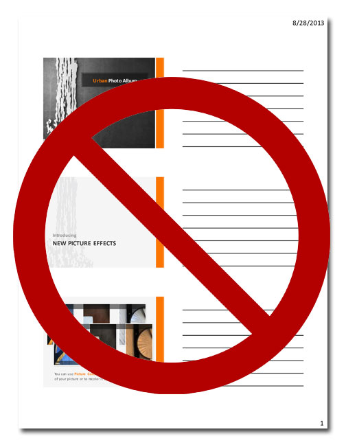
PowerPoint makes it easy to create handouts, but the default style is one of the worst things you can give your audience. Here's a better idea. Default PowerPoint handout Here's what the default PowerPoint handout looks like: It seems helpful enough. This kind of handout shows an image of your … [Read more...] about What’s the best kind of PowerPoint handout?
Presenting at trade shows: problems and solutions
The Small Business Expo—a business networking event, trade show, and conference for business professionals—was held in mid-October in Boston, Massachusetts. Among the many offerings at the SBE were numerous workshops designed to provide valuable business skills. The workshop I attended was being … [Read more...] about Presenting at trade shows: problems and solutions
How to make portraits look great in PowerPoint
To look their best, portraits (also known as "head shots") should all be about the same size on a slide. Usually, though, they're positioned and sized haphazardly, like this: Here we have huge Bob, followed by tiny Jill, then medium Gina. There's even someone lurking in the background behind … [Read more...] about How to make portraits look great in PowerPoint


