For the past several years, I have been working with people who share my conviction that the same design principles that are used to create award-winning websites, compelling logos, and stunning point-of-purchase displays can and should be used in PowerPoint presentations. This viewpoint isn't … [Read more...] about Audiences expect and deserve great PowerPoint design
March Slide Makeover of the Month
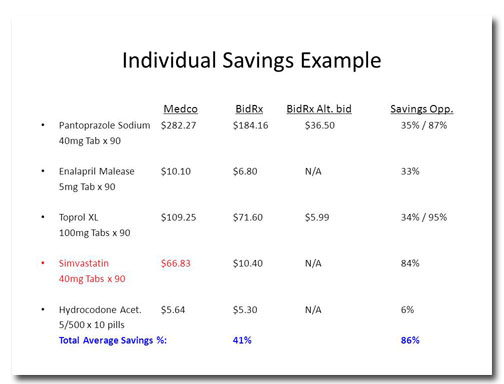
This month's slide comes from Design Dispatch subscriber Bob Carpenter of BidRx. His company wants to become the eBay or the Priceline of the pharmaceutical business. By logging on to BidRx, people will be able to get competitive pricing on their prescription medicine and save a bundle in the … [Read more...] about March Slide Makeover of the Month
How much does it cost to redesign a PowerPoint deck?
People always ask me "How much is will it cost to redesign my presentation?" Every design job is different so the costs vary from project to project. I'm not trying to hide a trade secret here, it's just the way it is. Only after I've had a conversation with a potential client and reviewed his deck … [Read more...] about How much does it cost to redesign a PowerPoint deck?
February Slide Makeover of the Month
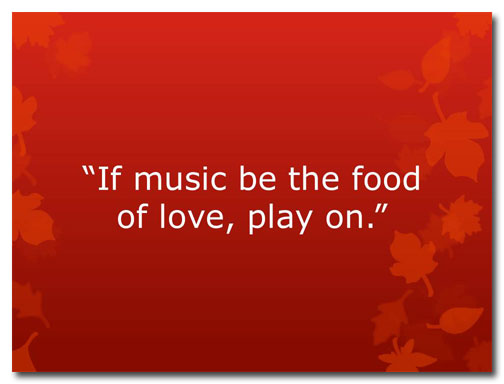
With February comes Valentine's Day so I thought I'd draw inspiration from William Shakespeare to address a common problem in slide layout: How do you format a quotation? Before Snore. Apart from the pleasant background color and graphics, this quotation is about as florid as a wet dishrag. This … [Read more...] about February Slide Makeover of the Month
January Slide Makeover of the Month
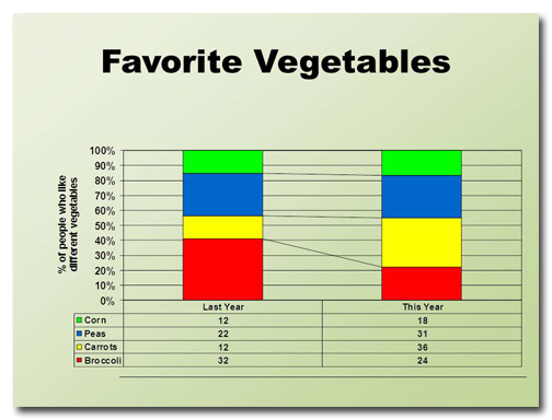
This month's slide was adapted from a real presentation I worked on in December. So as not to reveal proprietary information, the data have been changed but the slide layout is essentially the same. Before This slide took me a little while to figure out. I can tell that the four data points are … [Read more...] about January Slide Makeover of the Month
PowerPoint vs. Prezi: Which is better?
Throughout history, there have been many great rivalries: Red Sox vs. Yankees, Coke vs. Pepsi, Mac vs. PC. In the battle for the hearts and minds of the presentation community, perhaps there is no greater clash than PowerPoint vs. Prezi. Up-and-comer Prezi brings its A-game to the fight. It's … [Read more...] about PowerPoint vs. Prezi: Which is better?
Ready, Fire, Aim! The wrong way to design a PowerPoint deck
I once got a call from a woman who wanted some PowerPoint advice. She said something along the lines of, "Well, I've finished all the slides, now I need to work on my script." "You fool!" I wanted to shout. "You've done it backwards! Throw it away and start all over again!" Then I pictured myself … [Read more...] about Ready, Fire, Aim! The wrong way to design a PowerPoint deck
December Slide Makeover of the Month
This month's slide comes from a real presentation that a colleague of mine sat through. The image and text have been changed to protect the identity of the presenter, but it's essentially the same slide from the deck. Before Wow. This slide has it all: a tiny title, densely packed text, … [Read more...] about December Slide Makeover of the Month
