Here is a transcript from a horrible presentation made by rookie presenter, Joe Fumbler. In August 2012, I conducted a contest exclusively for Design Dispatch readers to find all the flubs made by Joe Fumbler during his presentation, and reader Robbie Kularski came up with eighteen mistakes! … [Read more...] about How to royally screw up a PowerPoint presentation
March Slide Makeover of the Month
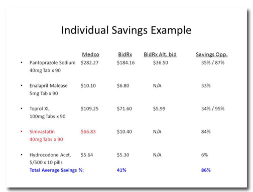
This month's slide comes from Design Dispatch subscriber Bob Carpenter of BidRx. His company wants to become the eBay or the Priceline of the pharmaceutical business. By logging on to BidRx, people will be able to get competitive pricing on their prescription medicine and save a bundle in the … [Read more...] about March Slide Makeover of the Month
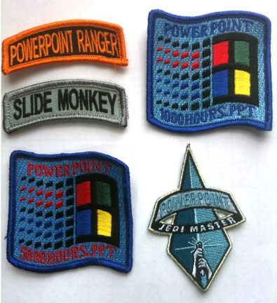
Are you a PowerPoint Ranger? Be proud!
Poor PowerPoint. This stalwart workhorse has been around for over two decades, supporting business presentations and facilitating communication for millions of people. But are they grateful? No, quite the contrary! You have people all over Twitter complaining about Death by PowerPoint and a snarky … [Read more...] about Are you a PowerPoint Ranger? Be proud!
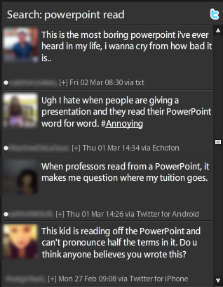
Do you read your PowerPoint slides to the audience? Knock it off!
According to a recent survey conducted by PowerPoint designer Dave Paradi, the number-one PowerPoint annoyance is when presenters read their slides to the audience. In fact, "reading from the slides" has been one of the top five most annoying PowerPoint habits since he started conducting this survey … [Read more...] about Do you read your PowerPoint slides to the audience? Knock it off!
February Slide Makeover of the Month
With February comes Valentine's Day so I thought I'd draw inspiration from William Shakespeare to address a common problem in slide layout: How do you format a quotation? Before Snore. Apart from the pleasant background color and graphics, this quotation is about as florid as a wet dishrag. This … [Read more...] about February Slide Makeover of the Month
January Slide Makeover of the Month
This month's slide was adapted from a real presentation I worked on in December. So as not to reveal proprietary information, the data have been changed but the slide layout is essentially the same. Before This slide took me a little while to figure out. I can tell that the four data points are … [Read more...] about January Slide Makeover of the Month
Ready, Fire, Aim! The wrong way to design a PowerPoint deck
I once got a call from a woman who wanted some PowerPoint advice. She said something along the lines of, "Well, I've finished all the slides, now I need to work on my script." "You fool!" I wanted to shout. "You've done it backwards! Throw it away and start all over again!" Then I pictured myself … [Read more...] about Ready, Fire, Aim! The wrong way to design a PowerPoint deck
December Slide Makeover of the Month
This month's slide comes from a real presentation that a colleague of mine sat through. The image and text have been changed to protect the identity of the presenter, but it's essentially the same slide from the deck. Before Wow. This slide has it all: a tiny title, densely packed text, … [Read more...] about December Slide Makeover of the Month


