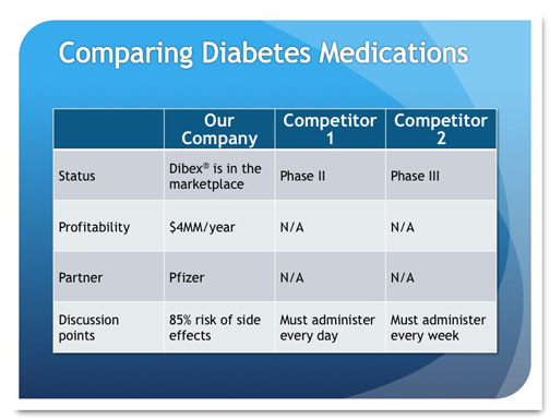
Sometimes it's necessary to tell your audience something that's not so great. Most presenters really don't want to be the Bad Guy, but it's important that their audiences have all the facts about what's going on, whether it's an underperforming fund, a bad quarter, negative ratings, or flagging … [Read more...] about How do you show bad news in PowerPoint?
January Slide Makeover of the Month
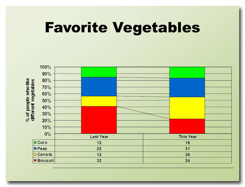
This month's slide was adapted from a real presentation I worked on in December. So as not to reveal proprietary information, the data have been changed but the slide layout is essentially the same. Before This slide took me a little while to figure out. I can tell that the four data points are … [Read more...] about January Slide Makeover of the Month
PowerPoint vs. Prezi: Which is better?
Throughout history, there have been many great rivalries: Red Sox vs. Yankees, Coke vs. Pepsi, Mac vs. PC. In the battle for the hearts and minds of the presentation community, perhaps there is no greater clash than PowerPoint vs. Prezi. Up-and-comer Prezi brings its A-game to the fight. It's … [Read more...] about PowerPoint vs. Prezi: Which is better?
Ready, Fire, Aim! The wrong way to design a PowerPoint deck
I once got a call from a woman who wanted some PowerPoint advice. She said something along the lines of, "Well, I've finished all the slides, now I need to work on my script." "You fool!" I wanted to shout. "You've done it backwards! Throw it away and start all over again!" Then I pictured myself … [Read more...] about Ready, Fire, Aim! The wrong way to design a PowerPoint deck
Three steps to becoming a Thought Leader
Thought leadership is a relatively new term that describes being known for one's expertise on a certain topic. A thought leader is seen as a visionary, someone with ideas that can improve the way things are done. Yesterday I officially became a thought leader. Become a PowerPoint Ninja in 2012 is … [Read more...] about Three steps to becoming a Thought Leader
December Slide Makeover of the Month
This month's slide comes from a real presentation that a colleague of mine sat through. The image and text have been changed to protect the identity of the presenter, but it's essentially the same slide from the deck. Before Wow. This slide has it all: a tiny title, densely packed text, … [Read more...] about December Slide Makeover of the Month
Animation in PowerPoint: too cool or too much?
After presenting my Cheating Death by PowerPoint workshop, I often ask people how they liked the animation. They usually answer "What animation?" Rather than feel discouraged that all that work I put into my deck went unnoticed, I'm overjoyed that the animation was so seamlessly integrated into the … [Read more...] about Animation in PowerPoint: too cool or too much?
You don’t need to number your PowerPoint slides. Discuss.
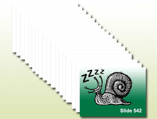
People often ask me to work with PowerPoint templates that include slide numbers. I can't imagine why slide numbers would be important. Maybe it makes presenters feel like they're accomplishing something if they glance at the screen and see that they're on slide 92, I don't know. But putting slide … [Read more...] about You don’t need to number your PowerPoint slides. Discuss.

