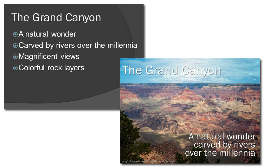
How many times have you heard "A picture's worth a thousand words"? At least a billion, right? But how often do you put this maxim into practice? If you're still trying to communicate difficult concepts in your presentations using lots of explanatory text, tables, and graphs, you may be … [Read more...] about Why is a picture worth 1,000 words? The picture superiority effect.
Becoming a better presenter with Toastmasters
Earlier this year, I was presenting a Cheating Death by PowerPoint lecture to a group of students. I had a 45-minute session planned that was chock-full of information I knew they could use. Before I started, I handed out evaluation forms so that I could see how well I did. When I finished, I … [Read more...] about Becoming a better presenter with Toastmasters
Presenting at trade shows: problems and solutions
The Small Business Expo—a business networking event, trade show, and conference for business professionals—was held in mid-October in Boston, Massachusetts. Among the many offerings at the SBE were numerous workshops designed to provide valuable business skills. The workshop I attended was being … [Read more...] about Presenting at trade shows: problems and solutions
I hate working in PowerPoint. Here’s a PDF instead.
It seems that the majority of graphic designers would rather have root canals than design a deck. Overall, they think PowerPoint sucks and that it's not possible to do great design using that software. So it came as no surprise that a graphic designer recently posted a way to avoid using PowerPoint … [Read more...] about I hate working in PowerPoint. Here’s a PDF instead.
How to make portraits look great in PowerPoint
To look their best, portraits (also known as "head shots") should all be about the same size on a slide. Usually, though, they're positioned and sized haphazardly, like this: Here we have huge Bob, followed by tiny Jill, then medium Gina. There's even someone lurking in the background behind … [Read more...] about How to make portraits look great in PowerPoint
How do I learn PowerPoint?
When I offer PowerPoint training, most of the time it's for people who already know how to use the software but who want to know more. What is good design? Where do I get photos to use in my presentations? Why do some colors go well together and others don't? How do I tell a story? These are the … [Read more...] about How do I learn PowerPoint?
Learn PowerPoint design by copying great billboards
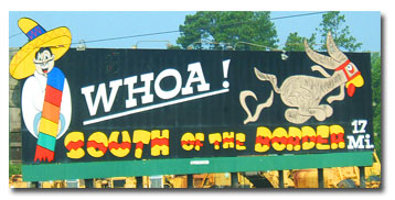
Like a PowerPoint slide, billboards must be immediately understandable by an audience that's experiencing numerous distractions. Good billboard design is like good slide design If you've ever driven on Interstate 95 from the Virginia/North Carolina to the South Carolina/Georgia state lines, you've … [Read more...] about Learn PowerPoint design by copying great billboards
The secrets of awesome PowerPoint handouts
PowerPoint handouts help people to remember a presentation. But too often, presenters distribute handouts that are totally useless. Here's how to change that. Traditionally, handouts were printed from the Handout View in PowerPoint and looked like this: This layout allows the audience to … [Read more...] about The secrets of awesome PowerPoint handouts
