Good typography is one way of telling whose deck was designed by a professional presentation designer and which one was done by a nondesigner. Sometimes the changes the professional makes are so subtle that you don't even notice that they're there, but when you compare the decks side-by-side it's … [Read more...] about Good PowerPoint Design: Typography and avoiding orphans
How to be a crappy presenter
Sometimes it seems like people go out of their way to be terrible at giving presentations. It's almost as if they follow these ten steps to being awful: 1. Show up at the last minute. To ensure that your audience realizes from the start that you are a crappy presenter, you should make it a … [Read more...] about How to be a crappy presenter
PowerPoint Cheat Sheet: 5 Essential production tricks
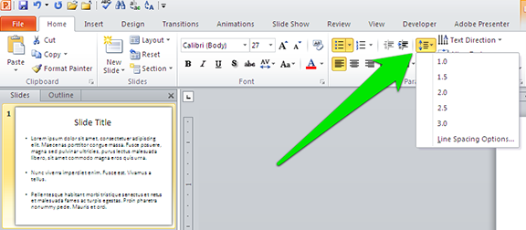
During a recent one-on-one PowerPoint training session, my client asked me how to make two lines of text fit onto one line. I quickly clicked on an icon and made some changes, causing the text to pop into place. "Whoa, whoa, whoa, what did you just do there?" the client asked. So I undid the … [Read more...] about PowerPoint Cheat Sheet: 5 Essential production tricks
The Ken Burns Effect in PowerPoint
When director Ken Burns set out to make his groundbreaking documentary The Civil War he had lots of visual resources he could draw upon: letters, photographs, engravings, and newspapers, to name a few. But still images make for really boring television, so he came up with a way to create videos from … [Read more...] about The Ken Burns Effect in PowerPoint
Where can I find music?
Adding music to PowerPoint presentations can be a great idea. Just as soundtracks help to set the mood in films, music can help to set the right tone (heh) for your PowerPoint presentations. Music, like pictures, has a universal language all its own, enabling an audience to react to what you're … [Read more...] about Where can I find music?
How to set default fonts in PowerPoint and why it’s important
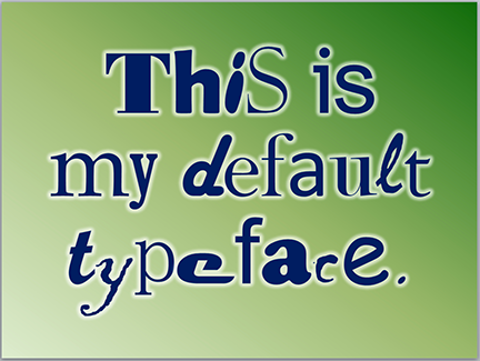
A colleague of mine told me that one of his clients wanted to know how to set a default typeface for all new PowerPoint documents. This client recognized the need for a consistent look for the PowerPoint decks his company produces. Bravo! Fortunately, if you already have a corporate PowerPoint … [Read more...] about How to set default fonts in PowerPoint and why it’s important
Why PowerPoint colors are important
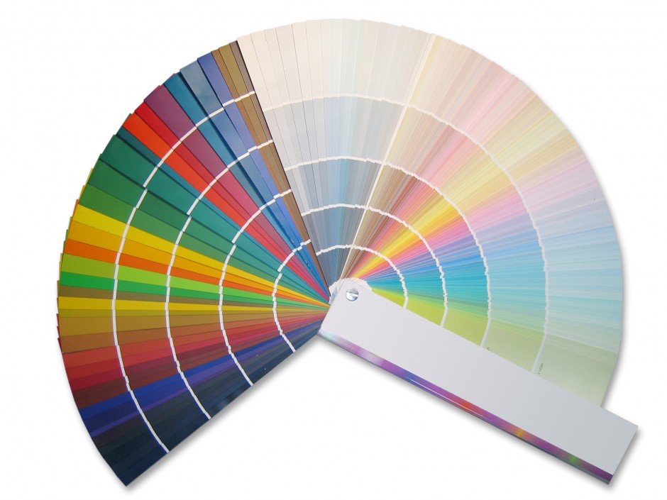
Color is a huge part of design and communication, but it's often ignored by people banging out PowerPoint presentations at the last minute. This can be a big mistake for several reasons. Colors are part of your brand. A company's brand is much more than just a logo; colors play a large part in … [Read more...] about Why PowerPoint colors are important
Why does PowerPoint suck?
It's easy to hate PowerPoint because it's so awful, right? I mean, how many ugly presentations should you have to sit through in your life? Don't people know that PowerPoint saps your will and makes you into a drooling zombie? It's just terrible and it should be outlawed. PowerPoint sucks! I … [Read more...] about Why does PowerPoint suck?


