Deciding on a slide format used to be easy when there was only one choice. Nowadays, you can choose between 4:3 format or 16:9. What do these numbers mean and which size should you choose for your presentations?
What the numbers mean
The above notation is called the “aspect ratio,” or the ratio of the width to the height of the slide. In the 4:3 aspect ratio, the dimensions are 1024 x 768 pixels (10.67″ x 8″); the height is 3/4 of the width. Back in the Ye Olde Days of PowerPoint, it was your only choice. Why? Because that’s the aspect ratio of actual slides, pictured above, television screens, and early computer monitors.
When high-definition screens came on the scene in the early 2000s, they were built in a 16:10 aspect ratio. But as more and more high-definition screens were manufactured, it became clear that screens with a 16:9 aspect ratio were cheaper to manufacture. So the 16:9 aspect ratio (1920 x 1080 pixels or 13.3″ x 7.5″) became the new standard.
What size should you choose?
From boardrooms to computer monitors to smartphone screens, 16:9 is the default screen aspect ratio so that’s the slide size I always go with. The 16:9 format gives you a lot of slide real estate to play around with! The legacy 4:3 aspect ratio, while still used, creates smaller slides and doesn’t look that great on newer screens.
How do you change an old 4:3 deck to the new 16:9 format?
Oh, this is super-fun to do and you’re a lucky duck if it becomes your job.
Not.
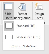
To resize your slides go to the Design tab on the ribbon and select Slide Size/Widescreen on the right side of the screen.

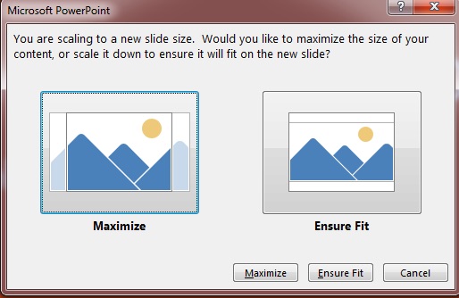
After you select the new size, this window will appear:

Now you’re faced with either everything on the slides being stretched out or squished to fill the space. Oh boy! Either way, after you make your selection you’ll need to go through the presentation slide by slide to ensure that everything looks good. This can be fairly straightforward if the creator of the presentation stayed within the template or a real pain in the rear if he/she didn’t. But do go through the deck to ensure that everything looks right.
If you’re a production artist that charges by the hour, reformatting an organization’s slides from 4:3 to 16:9 could be a nice little gig for you!
Other slide sizes for special events
Now, the 16:9 format is great for everyday use but what if you’re designing a presentation for an event? Last year, I was designing slides for a corporate conference where the setup included multiple, massive screens. For that event, the slides measured 52″ x 17″ and had a “leave this space blank” area on the bottom. Each event is different, so if you’re working on slides like these you need to become friends with the AV folks and find out what size slides they recommend for optimal viewing on that particular setup. The last thing you want to see on a gigantic stage are distorted graphics!
Bottom line
Unless you’re told otherwise, use the 16:9 format. You get a lot more space on each slide for your visuals and it’s really the way things are going.
