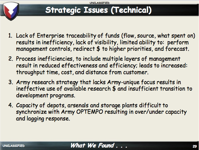
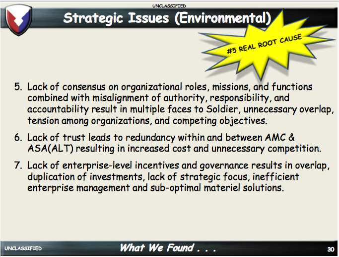
This month’s slide makeover comes courtesy of the US Army. In this pair of slides, they list the main Strategic Issues that are impeding the smooth management of the Army Materiel Command.
Before
While this information is important, there’s too much text. You’d go into this amount of detail in a handout, not a slide.
An important issue the presenter is trying to highlight is the fact that Issue 5 is the “real root cause” of the problems. But the starburst callout is an ineffective way to do this.
After
In the redesign, I combined these slides into one and added animation.
I edited the Strategic Issue down into short phrases. The presenter would click through the animation as he brought up each issue, giving the audience the full text that I removed from the original slides.
I found images that illustrate each Issue to call attention to their their results.
To differentiate between Technical and Environmental issues, I changed the color of the text boxes and the title of the slide changes. This is a change that the presenter would call attention to, so there’s no need for a legend.
Finally, I separated Issue 5 from the rest of the Issues, made it red, and made it push the other Issues aside as it comes into the frame, signifying that it is the most important one. This is a fact that the presenter would emphasize during the animation.


