This month’s slide makeover is from a deck I redesigned for Ellen Wingard of Ellen Wingard and Associates. She was leading a daylong workshop at the Harvard Business School and her presentation combined her own approach to management training with that of Linda Hill, a respected HBS professor.
Before
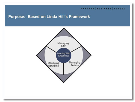
Ellen wanted an iconic graphic that would be seen throughout the presentation which illustrated Linda Hill’s framework on how to Lead with Excellence; this was her rough sketch.
She was required to use a standard HBS slide template. Unfortunately, the bold blue heading competes visually with the content and is distracting.
Her initial idea was to use pictures from the HBS community that illustrated the LWE concepts. Although we had a couple of photographs to choose from, it wasn’t clear whether the model releases that the photo subjects (hopefully) signed allowed this particular use. I found some relevant royalty-free images, but they made the graphic overly busy and impossible to read when reduced. So we decided that we needed to try another approach.
After
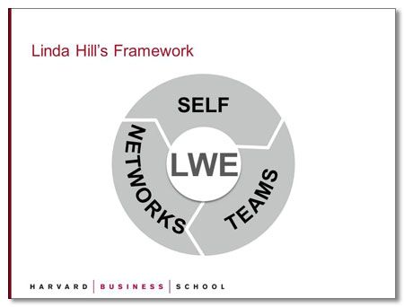
As it turns out, there is more than one HBS slide template. This one has more white space, allowing viewers to focus on content rather than background images.
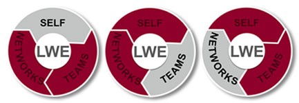
This grey LWE Framework icon introduces people to the whole Leading With Excellence concept. Each of the three sections are highlighted as they are addressed, as seen below:
 The icons were placed in the upper-left corner of each slide, showing the relationship of what Ellen was presenting to the LWE Framework.
By the way, these icons were created entirely in PowerPoint 2010, which has excellent drawing tools.


