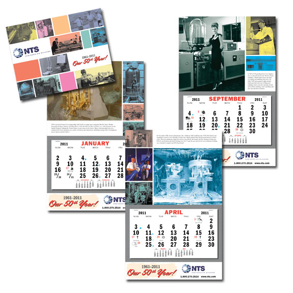
This fall, I was fortunate to work once again with Nia Carignan, Marketing Manager for NTS, on their annual calendar project. Unlike a calendar meant for retail sale, which would need to have been printed and ready to go by this summer, the NTS calendar is distributed by sales reps to customers, so it doesn’t have to be started until later in the year.
Next year marks the 50th anniversary of the founding of NTS, so we wanted to make this calendar special. But there was a problem: NTS was undergoing a total rebranding. The new logo wouldn’t be available until November, and templates with the new corporate style hadn’t even been considered yet. So I thought it would be a fun idea to do a retro-looking calendar, adding the new logo towards the end of the process when the marketing agency had finalized the design. Nia thought that was a great idea, so I started looking for inspiration.
I’ve always been a huge fan of magazines from about the 1940s through the 1960s, especially technical publications such as Popular Science and Popular Mechanics. I already had quite a collection, but I went on eBay anyway and picked up some issues of Mechanix Illustrated (One can never have enough reference material!). I wanted to create a look for the calendar that reflected the designs of these technical magazines, since NTS is a highly technical company and I figured that many of the older employees and customers would recognize the style.
When a company has been in business as long as NTS has, it tends to collect memorabilia. Nia brought a huge box of photographs and old technical reports dating back to the early days of the company to my studio to use in the calendar. What a treasure trove! It took a long time to choose the right images out of hundreds available, but I was able to get a good cross-section of photos from just about the whole history of the company. Of special interest were some pages from a photo album of an open house from the early 1960s, showing women hired for the event with huge bouffant hairdos. The pictures looked like something out of Mad Men.
Another fun aspect of this job was finding appropriate clip art to illustrate the holidays. All clip art had to be black and white, simple line drawings. This part of the process reminded me of some of my earliest design jobs.
Because Nia and I work so well together, we were able to turn the whole job around in just a little over a month, from initial concepts to printed calendars. And the effort was well worth it, because in Nia’s words “They are a big hit in Santa Clarita and are flying off the shelves.” Many of NTS’s older customers are taking a walk down Memory Lane while looking at these calendars, which is exactly the effect I was hoping for.

