October’s slide makeover is from a deck I found on SlideShare. There’s a lot to do on this bad boy, so let’s get started.
Before
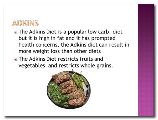
Ever hear of the “Adkins” Diet? Neither had I. The person who created this slide misspelled “Atkins” four times! If your audience is focusing on your typos and not your message, that’s a big problem. You lose credibility if you can’t even spell the topic of your presentation correctly! And people start making a game of it, wondering how you’ll screw up next. Not good.
There is way too much text on the slide, and it’s organized in a confusing way. Let’s break it down into single bullet points and type of message:
- Neutral The Adkins (sic) Diet is a popular low carb. diet
- Negative But it is high in fat and it has prompted health concerns
- Positive The Adkins Diet can result in more weight loss than other diets
- Neutral/Negative The Adkins Diet restricts fruits and vegetables, and restricts whole grains
After
 We’re going to break this down into four slides, and reorder the text to make a more logical Neutral > Positive > Neutral/Negative > Negative path. For the intro slide, I’ve included an image of the cover of the Atkins Diet book and enlarged the photo of the dinner plate. Oh, and I’ve corrected the spelling of “Atkins.”
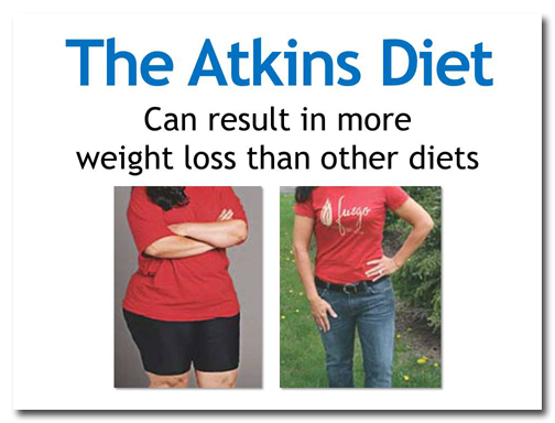 Images are effective, especially before-and-after photographs that show drastic results.
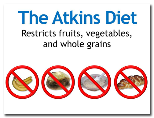 Photographs and the universal “NO” icon reinforce the idea of restricting certain kinds of foods.
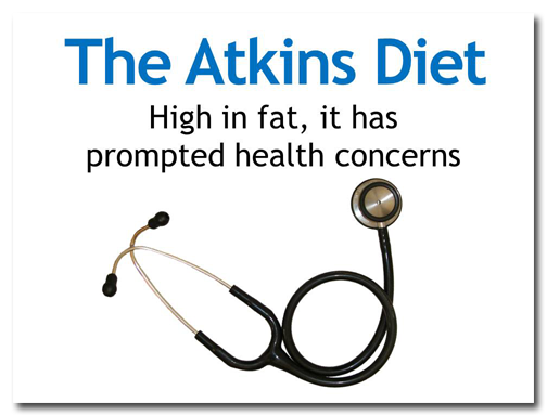
At first I thought about finding some kind of graph about fats or an image of fatty tissue, but I decided that a stethoscope would be a better representation of “health.”
So remember the elements of a good deck: less text on a slide, design and images that support the message, proper grammar, and no typos!

