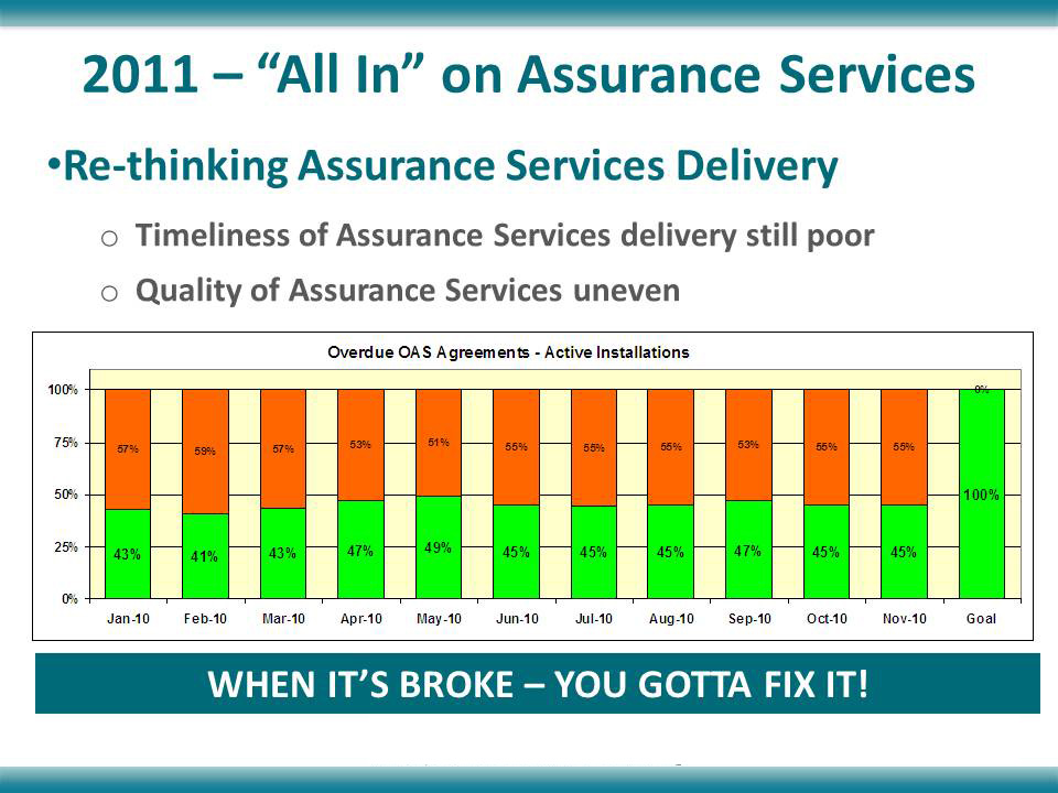
November’s slide comes from a company that specializes in indoor environmental quality. The message of the slide was that they could make some definite improvements on the level of service they were providing to their customers.
Before
This slide has a lot of information on it; too much to absorb at a glance:
- Main title
- Main bullet
- Sub-bullet
- Chart title
- Chart
- Declaration
The main point the presenter is trying to make is that nearly half of their OAS Agreements are late. Is this obvious to you? It took me a while to figure it out.
With so much text at the top of the slide, it’s hard to determine what the message is. Further down the slide, the chart title, “Overdue OAS Agreements – Active Installations,” indicates that there is a problem, but the text is so tiny that it gets lost.
Color also plays a role in the miscommunication. Usually, green means “go” or is seen as a positive color. By making the bottom half of the columns green, it implies that these figures are good. In fact, the chart shows that nearly half of all OAS Agreements are late, which is definitely not good.
Finally, the “100%” column on the far right isn’t needed, since by definition the totals shown in stacked columns on a chart of this type must add up to 100%.
After
I have eliminated the extra text at the top of the slide because I don’t want the audience to spend any time reading. Instead, I present a graph that clearly shows that the company needs to do better. Animation and color have been used to highlight the fact that over half of the OAS Agreements are late.
The colors were selected from the palette that I developed for this template, which harmonizes with the main aqua color. The first figures that you see, originally shown in green, are now a neutral grey. The data on late OAS Agreements are red, the color of danger and negativity.
After the animation plays out and the audience has had a chance to let this information sink in, the presenter would then talk about “rethinking Assurance Services delivery.”

