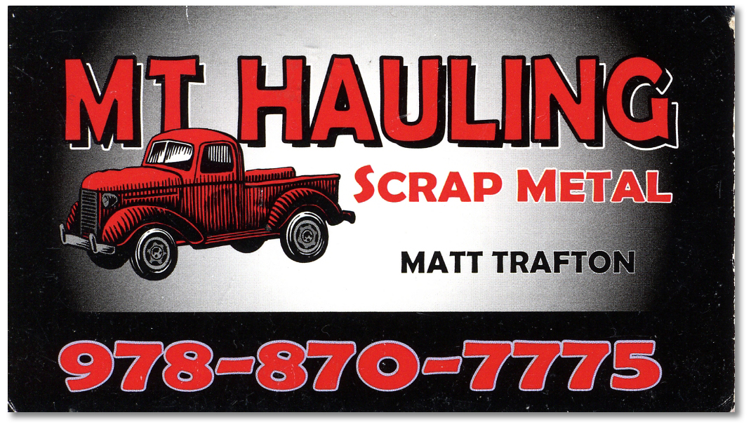
Sometimes in this age of electronic communications, 24/7 cable news channels, and instant Twitter and Facebook gratification it’s nice to come across an old-school design that works extremely well. Take a look at this beautiful business card:
Here’s a very basic two-color design used to beautiful effect. The color choices and the woodcut image of the old truck for me evoke memories of the past, and perhaps imply a simpler time and doing business with a handshake. I also love the fact that whoever designed this did it with a single font and a minimum of text, avoiding a common small-business pitfall of stuffing as much information on the card as will fit and showcasing all the great fonts available in Word, which they used to design their card.
Well done, anonymous business card designer!

