This month’s slide comes from Design Dispatch subscriber Bob Carpenter of BidRx. His company wants to become the eBay or the Priceline of the pharmaceutical business. By logging on to BidRx, people will be able to get competitive pricing on their prescription medicine and save a bundle in the process!
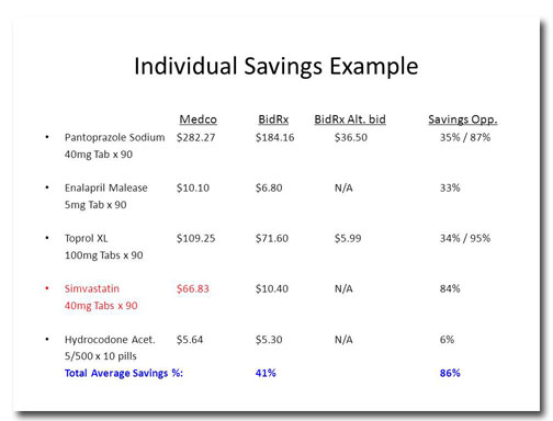
Before
There are some pretty compelling data in this table to support Bob’s assertion that people will save money by using BidRx, but this layout makes it hard to find. Tables are usually a bad idea to show an audience because with so much to analyze you lose people’s attention.
There’s a lot of extra information in this table. Showing the prices down to the penny might be accurate, but it clutters the table and doesn’t help to show the overall trend that BidRx’s prices are lower than Medco’s. And is it important for people to know the exact dosages of each medicine?
The biggest takeaway from this slide is that consumers stand to save up to 86% on this prescription. That’s a huge discount and is the key value proposition. So why is it so tiny and at the very bottom of the slide?
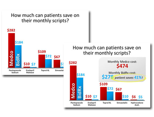
After
The first thing I did was to change the title of the slide. I like to think of slide titles as headlines, so they should be attention-grabbing and interesting. Next, I presented the data as a column chart, which makes it easy to compare Medco’s prices against BidRx’s.
The color choices I made are deliberate. In a financial setting, red = bad, so I’ve set up Medco as the “bad guy.” The BidRx columns are blue, a soothing color associated with health care.
The second image is what the slide looks like after the animation. I don’t want to leave it to chance that the audience will understand that BidRx’s prices are lower, so I tell them and I circle the amount people will save.
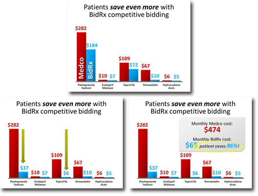
Next, I created a second slide to call out the even greater savings that could result from a competitive bidding situation:
I copied the chart from the previous slide, then animate the bars going down on two of the medicines and point out the lower prices with green arrows. Then the same summary box appears.


