Like a PowerPoint slide, billboards must be immediately understandable by an audience that’s experiencing numerous distractions.
Good billboard design is like good slide design
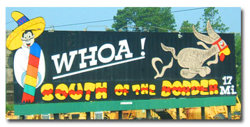
If you’ve ever driven on Interstate 95 from the Virginia/North Carolina to the South Carolina/Georgia state lines, you’ve no doubt seen a billboard like this one:

In fact, you probably saw quite a few of them. The owners of the roadside attraction South of the Border in Dillon, South Carolina, seem to know a little bit about marketing. Up and down I-95 are scores of billboards like this one that let drivers know about the wonders that await them at South of the Border. These billboards share a few things in common:
- They use the South of the Border brand consistently
- They’re designed using bold colors
- There is very little text on the billboard
People who design billboards know that their work will be seen by drivers who are driving fast and who experience a range of other distractions. The message of the billboard must be immediately understood and associated with the business that doing the advertising.
Similarly, your PowerPoint slides should immediately convey a message. Don’t make your audience decipher complicated tables, wade through dense paragraphs, or figure out what your diagrams mean. Your job as a presenter is to clarify concepts and make it easy for the audience to understand what you’re talking about.
It’s possible to design billboards
like an ugly PowerPoint slide
In contrast, let’s look at a poorly designed billboard:

What, are you kidding me? The only legible text on this billboard is “Share the joy” and “indigo.” This billboard is advertising the fact that subscribers to Indigo, a telecom company, can get a discount on airtime charges. And I only can tell because I have a high-resolution version of this image that allows me to zoom in on the pertinent details. Want to see?
I can’t make out much of the smaller text at all, and I’m going zero miles an hour in an office chair. I don’t suppose that people in traffic would be able to read this billboard, either. In fact, this billboard for all the world looks like a poorly designed PowerPoint slide!
How many times have you seen slides with text too small to read and with photos that don’t really illustrate the main message?
If you’re cramming too much content onto your slides, you could be creating the same effect as this ugly billboard: a visually confusing mess that makes the viewer work to understand the message. Instead, strive for the South of the Border billboard model. By using bold graphics, minimal text, and consistent branding, you might just capture people’s attention and get them to arrive at their final destination: understanding what you’re telling them!

