This month’s slide was adapted from a real presentation I worked on in December. So as not to reveal proprietary information, the data have been changed but the slide layout is essentially the same.
Before
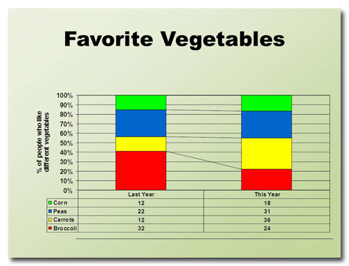
This slide took me a little while to figure out. I can tell that the four data points are supposed to add up to 100% and that they have changed from last year to this year. And I know that the diagonal lines that connect data points indicate whether percentages have increased or decreased from one year to the next. But what’s up with the table underneath the graph?
If there are two different types of charts the assumption is that there are two different data sets. In this case, however, the two charts present the same data. It took me a while to figure this out, and I didn’t even have a presenter talking to me at the same time. Imagine what the audience would be going through.
The color choices are not good because they are too bright and don’t harmonize with the background. It’s the default color set, and it shows.
Adding to the confusion are the grid lines and the vertical title at right.
All in all, this slide requires way too much work on the part of the audience to figure out what’s going on.
After
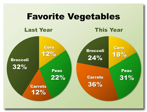
A pie chart is a much better way to show how percentages add up to 100%. Because it’s easy to see what wedges have gotten larger or smaller I have eliminated the comparison lines.
Notice the colors I’ve chosen? These are the colors of the vegetables in question. Not all data lends itself so well to obvious color choices, though, so when in doubt use the palette that comes with the template you’re using.
Because I have added titles to the wedges there’s no longer any need for a legend. I’ve also removed the vertical text because it was completely redundant.
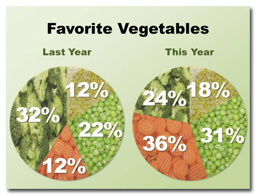
But what if you wanted to reduce the text even further? In this case, using photographs as fills is a great solution:
Now it’s obvious which vegetables are being charted!


