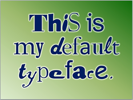
 A colleague of mine told me that one of his clients wanted to know how to set a default typeface for all new PowerPoint documents. This client recognized the need for a consistent look for the PowerPoint decks his company produces. Bravo!
Fortunately, if you already have a corporate PowerPoint template it’s very easy to set a default typeface. In fact, most of it’s been done for you because corporate templates are already set up to use particular typefaces in the title and text blocks. But what do you do when you’ve got some rogue operator who wants to add a bunch of his own text blocks to the slide?
How to set default fonts
Slide masters are set up so that all of the usual text boxes—titles, content, etc.—use specific fonts, weights, and sizes. The reason for this is to make using a template idiot-proof. Trouble is, a new kind of idiot comes along and creates new text boxes that aren’t part of the template, possibly adding new typefaces.
But to get around this, all you need to do is to create a default text box style in your template. Here’s how:
- Open the template and create a text box.
- Type a word.
- Double-click on the word to select it, then set it to whatever you want the default type style to be. Select the font you want, the color, the alignment, the size, the space between the letters—anything you want to become the default.
- When you’re done, right click on the text box to select it, then choose “Set as Default Text Box” on the pop-up menu.
- Delete the text box, then save the file as a template (.potx).
Now, whenever someone uses that template to create a new presentation, the default text box will have the settings you’ve just created.
Is it foolproof?
Heck, no. The type attributes can always be changed on any text box. But at least it’s a step in the right direction.
Why it’s important
Companies spend a lot of money establishing their brands. Why? Because doing so is the key to differentiation, that which makes one company rise above the rest and be more attractive to consumers. Brands are reinforced by a company’s marketing mix—the combination of all of the different kinds of marketing that it produces. The marketing mix includes websites, commercials, vehicle graphics, packaging, white papers, case studies, Twitter home pages, uniforms, email signatures…in short, anything that can be branded. Any single component of the marketing mix should be easy to identify as coming from that particular company. This consistency is essential for building a brand identity.
Of course, PowerPoint presentations are also a part of this marketing mix since they are brandable communication designed to influence an audience to take action. So why in the world do some people play fast and loose with their decks, using any old typeface they like, diluting the brand? It’s because they don’t know any better. But you do.
Keep it professional, stick to the corporate typefaces, and stay away from Comic Sans.
