You’ve just been told that you’re responsible for your company’s next big presentation. Due tomorrow. And you have no corporate PowerPoint template or theme. Uh-oh! How are you going to get in front of your prospects without a well-designed presentation? By using one of the built-in PowerPoint themes? Pfft! Have you even looked at those?
Fortunately, it’s is possible to knock together a quick corporate template that bears more than a passing resemblance to your other marketing materials. It isn’t a substitute for a well-designed theme and style guide, but it’ll do in a pinch. Here’s how to do it:
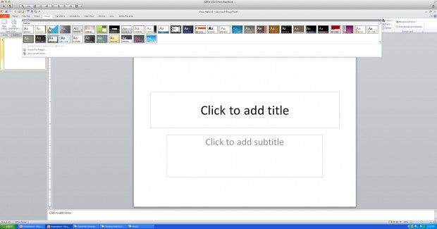
- Start with the Office Theme, the very first choice on the far left of the screen in the Design tab.

- Click on the Colors button.

- Pick a palette from the list that contains colors that look good with your company logo.

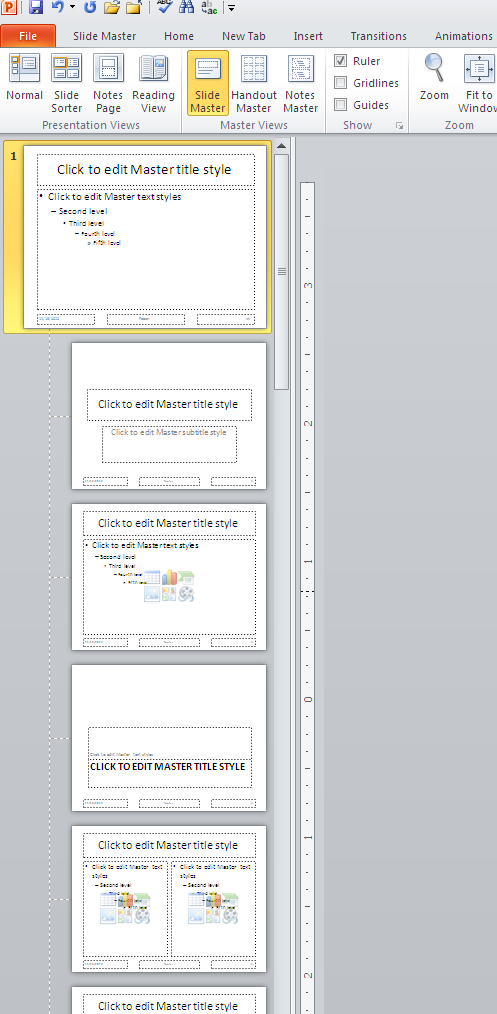
- Go to View/Slide Master.

- Click on the Office Theme slide master (the first one in the display on the left).

- Select all of the text boxes on the slide master and change the font to your corporate font (if it’s available) or something that resembles it.
- You know you don’t need your logo on every slide, and that big header and footer blocks just take up space, right? If you do but your boss doesn’t, then you can add these onto the master slide.
- Furthermore, you know that you don’t need slide numbers, right? Delete all of the footer placeholders. Insist on this.
- If the white background seems too stark, change it here in the slide master. You might add a splash of color by inserting graphics taken from your company website and using them on the top or bottom of the slide. Just be sure these are of a high enough resolution to display properly, and don’t add too much distracting stuff in the master.
- When you’re done editing the slide master, click the Slide Master tab, then click on the Close Master View button on the right.

- Start typin’ mister (or missus) because you’ve got work to do!

