Sometimes it’s necessary to tell your audience something that’s not so great. Most presenters really don’t want to be the Bad Guy, but it’s important that their audiences have all the facts about what’s going on, whether it’s an underperforming fund, a bad quarter, negative ratings, or flagging sales. If people don’t know what’s wrong, it’s hard to develop a plan to fix the problem.
But you don’t want the whole presentation to be a downer, so you need to temper the bad news with some good news:
“Yes, sales are down 4% this quarter, but we have hired a sales mentor who is working with our team to bring their numbers back up.”
“We received some negative feedback on Twitter about our widget, so we contacted every unsatisfied customer and fixed their problems.”
“Fund X did not perform to expectations, so we are diversifying our holdings.”
You should address bad news but you don’t have to lead with it. Here’s what I mean.
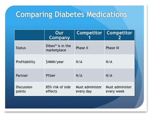
I recently met with a medical product client who showed me his “Pitch Deck,” the presentation he gives to venture capital firms and other groups when he seeks funding for his company. One slide showed a table that compared their company’s product against similar products being developed by two competitors. My client had a lot of great things going for him:
- His company already had products in the marketplace
- These products were making money
- They had big-name partners
This product also had a slight problem: it causes a medical condition in 85% of its users.
The slide looked a bit like this (The data have been changed to protect proprietary information.):
I asked him about it, and he said that it is a common side effect for this kind of medication and that it is easily treated during outpatient surgery with great results. So the story he’s trying to tell is Great News, Great News, Great News, No Big Deal. But when I look at this table as a member of the audience might, I see this story: Great News, Great News, Great News, Slam-on-the-Brakes Major Problem!!!
While it’s important for investors to have all the facts, it’s crazy to present the data in a table that doesn’t stress the positive and provides any relief for the negative.
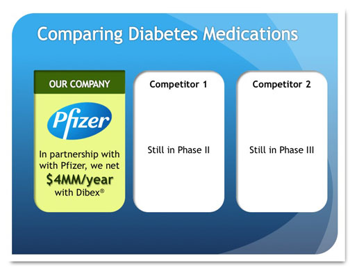
Here’s how I would redesign this slide:
This slide focuses on the positive by including a well-known partner logo, making the yearly profits stand out with large type, and showing the product name, which has been trademarked and is on the market. The first panel is green, which implies “go” and “cash,” and the competitors’ panels are drab by comparison. Look at how they lag behind! Who wouldn’t want to fund this guy?
But it would be unethical to withhold the bad news, so here it is:
Here, I’ve emphasized the fact that the side effect won’t kill patients and can be corrected fairly easily. The presenter would discuss the side effect and its treatment in greater detail when he’s in front of the audience.
Your Turn
Have you ever had to give bad news during a presentation? How did you do it and how was it received?


