 Good typography is one way of telling whose deck was designed by a professional presentation designer and which one was done by a nondesigner. Sometimes the changes the professional makes are so subtle that you don’t even notice that they’re there, but when you compare the decks side-by-side it’s obvious that one looks better.
Let’s talk about orphans. In typographic terms, a “orphan” is a single word that appears below the last line of text in a paragraph. It looks like this:
The quick brown fox jumps over the lazy
dog.
In this case, the word “dog” is the orphan. You’ve probably seen lots of slides with this problem; it’s a common error that usually goes uncorrected. Here’s how the text should look:
The quick brown fox
jumps over the lazy dog.
Whenever possible, you should correct orphans wherever they appear on your slides. Although the change is small, it will make your decks look more refined. Let’s compare two bulleted lists:
Bad typography:
- We should strive to exceed our customers’
expectations - Go above and beyond to provide excellent customer
service - Delighted customers will be our brand
ambassadors
Good typography:
- We should strive to exceed
our customers’ expectations - Go above and beyond to
provide excellent customer service - Delighted customers will
be our brand ambassadors
Sure, the effect is subtle, but designers do it all the time. Go ahead, look at any book or magazine and I’ll bet you don’t find many orphans at the ends of lists and paragraphs. When you start getting into the habit of correcting this fault on your slides, it will be just another way that your decks will look better.
There are three ways to get rid of orphans:
- Insert a soft return where you want the line break to appear. A soft return is when you use the Shift+Return to create a line break. This keeps the lines part of the same paragraph and does not create a new bullet point in a list.
- Increase or reduce the size of the text box. By making your text boxes wider or narrower you can force the text to go where you want it to. Be careful about doing this, because if you’re using a template then you don’t want the slide to look too different from other slides that use the same layout.
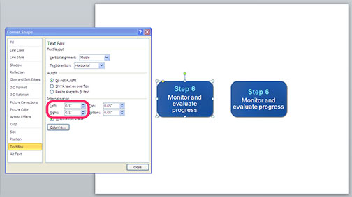
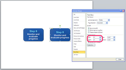
- Decrease the margins within an object. If you are getting an orphan when you’re typing text into an object, you can often fix it by reducing the margins within the object. To do this, right-click on the object, select “Format Text Box” then reduce all of the margins to 0″. Here’s how this looks:


Once you get into the habit of eliminating orphans in your decks it will become second nature to you and your slides will look better!
