If you want people to be able to compare data, then tables are just about the worst way you can do it.
Before: Here’s a wall of information for you. Have fun!
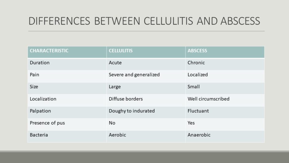
Sometimes, tables can be a useful way to display data. But if you let PowerPoint do the formatting, then you get a useless table like this. All of the information is on the slide at once, so the viewer must read the whole thing from top to bottom. They’re not getting the information they need at a glance, so it’s more work for them to interpret. And if people are trying to interpret your slides, they’ll be paying less attention to you while your presenting.
After: Rearranged text, slow reveal

As you can see in the animation above, “cellulitis” is on the left, “abscess” is on the right, and the characteristics are in the center. The characteristics are in all caps and a contrasting color to make them stand out from other text on the slide. And faint lines link each characteristic to both the “cellulitis” and “abscess” columns, which makes it immediately apparent to the most casual observer that they are related.
Of course, the animation wouldn’t go this fast during the actual presentation. The presenter would control the speed that each characteristic was revealed, allowing time to discuss each one in turn.
The Takeaway
Don’t make your audience work! By their very nature, tables demand to be read. If you’re asking people to both read and make comparisons it adds another layer of complexity.
If you want people to be able to make comparisons, rearranging the type on your slide and controlling the speed at which information is revealed will make that task much easier.