If you have important or surprising information you wish to highlight in your presentation, maybe the worst way you can do it is by using a table.
Before
Problem 1
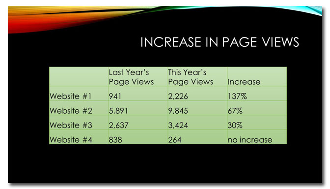
In order to determine what’s important with a table, you have to read it and be able to make sense of what you’ve read. It’s impossible to glance at a table and immediately understand its significance.
Problem 2
The first row shows a remarkable increase in page views, but it’s not obvious or called out in any way.
Problem 3
The last row in the table shows a marked decrease in page views. Because it’s labeled “no increase” it doesn’t look like that big a deal. The information isn’t expressed as a percentage so it’s hard to compare the performance of website # 4 against the others.
After

Solution 1
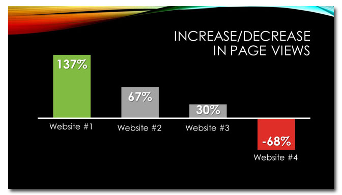
Forget the table. To make these data immediately apparent to the most casual observer (a favorite phrase of my 9th-grade geometry teacher), a chart is the best choice.
Solution 2
The color green is associated with words like “go” and “positive,” so I used it for the first column to indicate that a 137% increase in page views is a good thing.
Solution 3
I’ve done two things. First, I calculated the percentage decrease in page views for website #4 (click here to learn how to determine percentage increase or decrease). Using this number, I created column for website #4 and made it red, which has negative connotations.
In conclusion…
Don’t hide important information in tables because that makes your audience work too hard to find it.
[button link=”https://www.lauramfoley.com/gallery-2/” color=”orange” target=”_self” size=”small” title=”Back to Gallery”]Back to Gallery[/button]
[divider style=”shadow”]
Submit your own slide for a Makeover!
If you subscribe to the Cheating Death by PowerPoint newsletter you can receive a free Slide makeover! Here’s the deal: In exchange for permission to use your slide in the newsletter and on this website for promotional purposes, you’ll get the redesigned PowerPoint slide file to use in any way you like. So not only do you get access to a step-by-step video on how the slide was redesigned and the source file, you learn the reasons behind all of the changes!
You’ll also get a free eBook, Cheating Death by PowerPoint: Essential PowerPoint Tips, Tricks, and Best Practices, which includes loads of advice on how to improve the way you work with PowerPoint!
[button link=”https://list.robly.com/subscribe?a=c4115aa351a8e513f6e3b7af8ffaf943″ color=”default” target=”_blank” size=”small”]Subscribe to the Cheating Death by PowerPoint newsletter[/button]
[divider style=”shadow”]
[button link=”#top” color=”gray” target=”_self” size=”small” title=”Back to top”]Back to top[/button]


