Sometimes a table is the best way to allow people to make comparisons. Good design and animation can make tables even more effective. Here’s how to do it.
Before
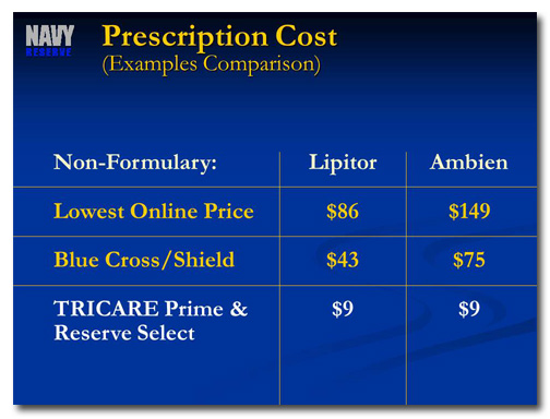
This slide was taken from a presentation designed to convince retiring US Navy officers to join the Navy Reserve. The point of this slide is to highlight the cost savings when people are covered under the TRICARE Prime & Reserve Select plan. Since the other options are colored gold, though, these stand out more on the slide. We can redesign this slide to eliminate unnecessary distractions (“non-formulary”?!?) and to focus attention on where it should be.
After
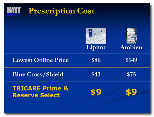
At first, I thought the solution should be to change the table data into a graph. I tried it, and it came out even more confusing than the table. So I went back to the old drawing monitor and tried a new approach, a redesigned table with animation.
Check out this video to get the whole story on how this slide was redesigned:
[button link=”https://www.lauramfoley.com/gallery-2/” color=”orange” target=”_self” size=”small” title=”Back to Gallery”]Back to Gallery[/button]
[divider style=”shadow”]
Submit your own slide for a Makeover!
If you subscribe to the Cheating Death by PowerPoint newsletter you can receive a free Slide makeover! Here’s the deal: In exchange for permission to use your slide in the newsletter and on this website for promotional purposes, you’ll get the redesigned PowerPoint slide file to use in any way you like. So not only do you get access to a step-by-step video on how the slide was redesigned and the source file, you learn the reasons behind all of the changes!
You’ll also get a free eBook, Cheating Death by PowerPoint: Essential PowerPoint Tips, Tricks, and Best Practices, which includes loads of advice on how to improve the way you work with PowerPoint!
[button link=”https://list.robly.com/subscribe?a=c4115aa351a8e513f6e3b7af8ffaf943″ color=”default” target=”_blank” size=”small”]Subscribe to the Cheating Death by PowerPoint newsletter[/button]
[divider style=”shadow”]
[button link=”#top” color=”gray” target=”_self” size=”small” title=”Back to top”]Back to top[/button]


