Tiny pictures rarely look good on slides. Go big and see what a difference it makes!
Before
This slide is quite straightforward and doesn’t waste time with any bullet points. Well done! However, the text that is there is repetitive and the photo is so small that it lacks impact.
After
This slide makeover was simplicity itself, and everything I needed was already there.
Check out this video to get the whole story on how this slide was redesigned:
[button link=”https://www.lauramfoley.com/gallery-2/” color=”orange” target=”_self” size=”small” title=”Back to Gallery”]Back to Gallery[/button]
[divider style=”shadow”]
Submit your own slide for a Makeover!
If you subscribe to the Cheating Death by PowerPoint newsletter you can receive a free Slide makeover! Here’s the deal: In exchange for permission to use your slide in the newsletter and on this website for promotional purposes, you’ll get the redesigned PowerPoint slide file to use in any way you like. So not only do you get access to a step-by-step video on how the slide was redesigned and the source file, you learn the reasons behind all of the changes!
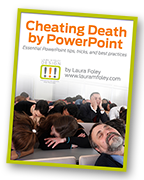
You’ll also get a free eBook, Cheating Death by PowerPoint: Essential PowerPoint Tips, Tricks, and Best Practices, which includes loads of advice on how to improve the way you work with PowerPoint!
[button link=”https://list.robly.com/subscribe?a=c4115aa351a8e513f6e3b7af8ffaf943″ color=”default” target=”_blank” size=”small”]Subscribe to the Cheating Death by PowerPoint newsletter[/button]
[divider style=”shadow”]
[button link=”#top” color=”gray” target=”_self” size=”small” title=”Back to top”]Back to top[/button]


