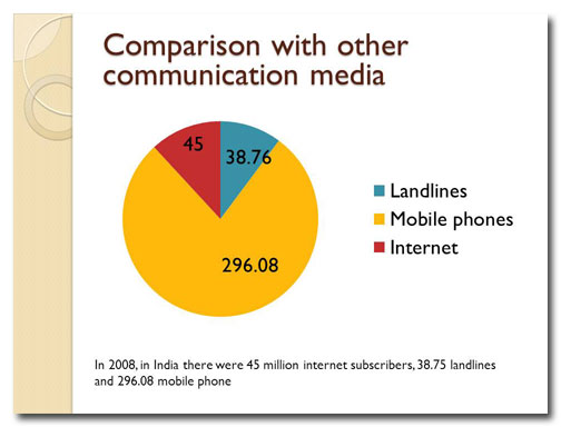
A common mistake is to show the wrong type of data in a pie chart. Here’s what to look for and how to fix it.
Before
A typical pie chart, right? Well, this slide has some problems, with too much text and a very unhelpful title. But the biggest problem is the way the pie chart is used. Pie charts are meant to represent fractions of a whole. So if you’re comparing numbers, they need to be expressed as percentages so that the pie chart makes sense.
There’s something else wrong with this slide. It might not be apparent to you right now, but I guarantee you that the problem will become very obvious when you see the video!
After
We rewrite the slide title, delete unnecessary copy, fix the pie chart, and get rid of a needless distraction.
[button link=”https://www.lauramfoley.com/gallery-2/” color=”orange” target=”_self” size=”small” title=”Back to Gallery”]Back to Gallery[/button]
[divider style=”shadow”]
Submit your own slide for a Makeover!
If you subscribe to the Cheating Death by PowerPoint newsletter you can receive a free Slide makeover! Here’s the deal: In exchange for permission to use your slide in the newsletter and on this website for promotional purposes, you’ll get the redesigned PowerPoint slide file to use in any way you like. So not only do you get access to a step-by-step video on how the slide was redesigned and the source file, you learn the reasons behind all of the changes!
You’ll also get a free eBook, Cheating Death by PowerPoint: Essential PowerPoint Tips, Tricks, and Best Practices, which includes loads of advice on how to improve the way you work with PowerPoint!
[button link=”https://list.robly.com/subscribe?a=c4115aa351a8e513f6e3b7af8ffaf943″ color=”default” target=”_blank” size=”small”]Subscribe to the Cheating Death by PowerPoint newsletter[/button]
[divider style=”shadow”]
[button link=”#top” color=”gray” target=”_self” size=”small” title=”Back to top”]Back to top[/button]


