No matter how fascinating the subject, if you load your slides with too much text and a confusing layout you’ll just baffle your audience.
Before
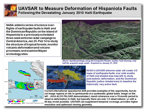
This slide is about a technology that NASA is using to map earthquake regions . It’s very interesting stuff, but it’s hard to know where to look on this slide. The pictures are fine, but they’re scattered around and the captions are trying to follow them. With all of this to look at, the audience will be too busy trying to read and interpret the information to pay attention to the presenter.
After
Simplify, simplify, simplify. Breaking down complex information into smaller parts makes it easier for people to understand.
[button link=”https://www.lauramfoley.com/gallery-2/” color=”orange” target=”_self” size=”small” title=”Back to Gallery”]Back to Gallery[/button]
[divider style=”shadow”]
Submit your own slide for a Makeover!
If you subscribe to the Cheating Death by PowerPoint newsletter you can receive a free Slide makeover! Here’s the deal: In exchange for permission to use your slide in the newsletter and on this website for promotional purposes, you’ll get the redesigned PowerPoint slide file to use in any way you like. So not only do you get access to a step-by-step video on how the slide was redesigned and the source file, you learn the reasons behind all of the changes!
You’ll also get a free eBook, Cheating Death by PowerPoint: Essential PowerPoint Tips, Tricks, and Best Practices, which includes loads of advice on how to improve the way you work with PowerPoint!
[button link=”https://list.robly.com/subscribe?a=c4115aa351a8e513f6e3b7af8ffaf943″ color=”default” target=”_blank” size=”small”]Subscribe to the Cheating Death by PowerPoint newsletter[/button]
[divider style=”shadow”]
[button link=”#top” color=”gray” target=”_self” size=”small” title=”Back to top”]Back to top[/button]


