Companies and organizations love to show off the logos of their biggest clients. When they do so on a slide, the result is often a mishmash.
Before
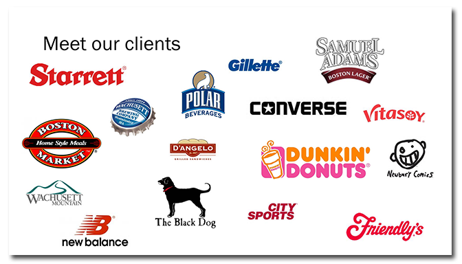
The title of this slide is in an awkward place, so the logos look like they’re swarming around it. There is a grouping of blue logos which is distracting when you notice it (You’re welcome!). And the Starrett and Dunkin’ Donuts logos are slightly larger than the rest of them. Are these clients more important? Sure seems that way.
After
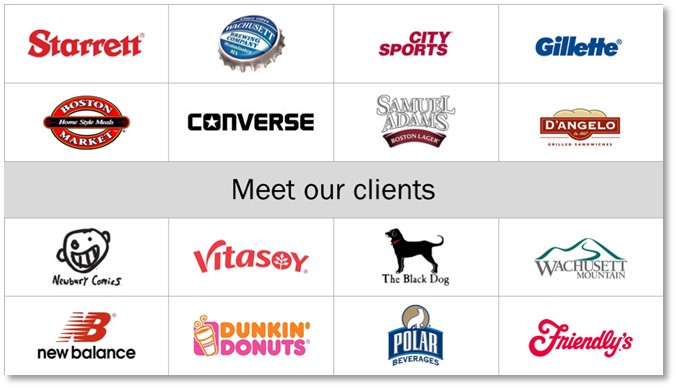
First, I created a grid of boxes with thin grey lines. I placed the logos in the center of each box and made them all about the same size. Finally, I repositioned the title to the middle of the slide. The resulting slide looks clear, balanced, and professional!

Key Points
Too much randomness can be confusing. Organize icons and logos in a grid for clarity.
[button link=”https://www.lauramfoley.com/gallery-2/” color=”orange” target=”_self” size=”small” title=”Back to Gallery”]Back to Gallery[/button]
[divider style=”shadow”]
Submit your own slide for a Makeover!
If you subscribe to the Cheating Death by PowerPoint newsletter you can receive a free Slide makeover! Here’s the deal: In exchange for permission to use your slide in the newsletter and on this website for promotional purposes, you’ll get the redesigned PowerPoint slide file to use in any way you like. So not only do you get access to a step-by-step video on how the slide was redesigned and the source file, you learn the reasons behind all of the changes!
You’ll also get a free eBook, Cheating Death by PowerPoint: Essential PowerPoint Tips, Tricks, and Best Practices, which includes loads of advice on how to improve the way you work with PowerPoint!
[button link=”https://list.robly.com/subscribe?a=c4115aa351a8e513f6e3b7af8ffaf943″ color=”default” target=”_blank” size=”small”]Subscribe to the Cheating Death by PowerPoint newsletter[/button]
[divider style=”shadow”]
[button link=”#top” color=”gray” target=”_self” size=”small” title=”Back to top”]Back to top[/button]


