Slide presentations meant to recruit people to your cause should be exciting and dynamic! Let’s see how we can improve on a slide that has some good information but a plain delivery.
Before
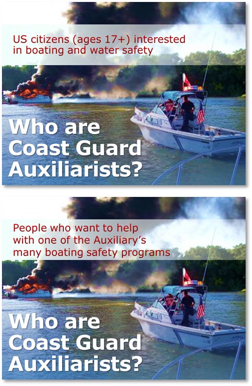
This slide comes from a presentation from the Coast Guard Auxiliary. They are trying to recruit new members and provide information on joining. But the way this slide is laid out, the CGA doesn’t seem like an exciting place to serve. In fact, this looks like a picture of a leisurely cruise around the bay. Not the stuff heroes are made from.
After
I found the most exciting photo of the CGA in action that I could find and split it into two slides. Take a look!

Key Points
Don’t put too much text on your slides and use dynamic, exciting photographs when you can. For more information on finding free photos for your presentations, click here.
[button link=”https://www.lauramfoley.com/gallery-2/” color=”orange” target=”_self” size=”small” title=”Back to Gallery”]Back to Gallery[/button]
[divider style=”shadow”]
Submit your own slide for a Makeover!
If you subscribe to the Cheating Death by PowerPoint newsletter you can receive a free Slide makeover! Here’s the deal: In exchange for permission to use your slide in the newsletter and on this website for promotional purposes, you’ll get the redesigned PowerPoint slide file to use in any way you like. So not only do you get access to a step-by-step video on how the slide was redesigned and the source file, you learn the reasons behind all of the changes!
You’ll also get a free eBook, Cheating Death by PowerPoint: Essential PowerPoint Tips, Tricks, and Best Practices, which includes loads of advice on how to improve the way you work with PowerPoint!
[button link=”https://list.robly.com/subscribe?a=c4115aa351a8e513f6e3b7af8ffaf943″ color=”default” target=”_blank” size=”small”]Subscribe to the Cheating Death by PowerPoint newsletter[/button]
[divider style=”shadow”]
[button link=”#top” color=”gray” target=”_self” size=”small” title=”Back to top”]Back to top[/button]


