Writing about statistics is like singing about flavor…it works, but not very well. People understand statistical data better when they’re in graphic form.
Before
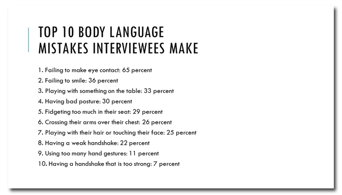
These are some interesting statistics, but you have to read each sentence from start to finish to understand the message. Because the numbers are written out rather than displayed visually, it’s hard to quickly compare data points at a glance.
After
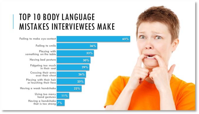
A bar chart is a much better tool for displaying these kind of statistics. And the chart can be further enhanced with a photo of a nervous person, which reinforces the messsage.

Key Points
Don’t write about statistics, chart them! And if a photo helps you to communicate your message, all the better!
[button link=”https://www.lauramfoley.com/gallery-2/” color=”orange” target=”_self” size=”small” title=”Back to Gallery”]Back to Gallery[/button]
[divider style=”shadow”]
Submit your own slide for a Makeover!
If you subscribe to the Cheating Death by PowerPoint newsletter you can receive a free Slide makeover! Here’s the deal: In exchange for permission to use your slide in the newsletter and on this website for promotional purposes, you’ll get the redesigned PowerPoint slide file to use in any way you like. So not only do you get access to a step-by-step video on how the slide was redesigned and the source file, you learn the reasons behind all of the changes!
You’ll also get a free eBook, Cheating Death by PowerPoint: Essential PowerPoint Tips, Tricks, and Best Practices, which includes loads of advice on how to improve the way you work with PowerPoint!
[button link=”https://list.robly.com/subscribe?a=c4115aa351a8e513f6e3b7af8ffaf943″ color=”default” target=”_blank” size=”small”]Subscribe to the Cheating Death by PowerPoint newsletter[/button]
[divider style=”shadow”]
[button link=”#top” color=”gray” target=”_self” size=”small” title=”Back to top”]Back to top[/button]


