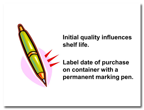
In this makeover, I’ll show you three changes that can be made to this slide that’ll make it POP!
Before
This slide came from a deck that introduces the concepts of using herbs and spices in one’s cooking. Although this was from a course offered at the college level, the use of clip art throughout the presentation lent it a childish feeling. I also wanted to address the fact that there are two separate ideas presented on the slide, the second one being incomplete.
After
I split this into two slides, added photographs, and expanded on the idea of writing the purchase date on spice jars to make this slide more informative and visually interesting.
Key Points
Limit yourself to one idea per slide, use photos instead of clip art, and include needed information to create memorable and instructive presentations.
[button link=”https://www.lauramfoley.com/gallery-2/” color=”orange” target=”_self” size=”small” title=”Back to Gallery”]Back to Gallery[/button]
[divider style=”shadow”]
Submit your own slide for a Makeover!
If you subscribe to the Cheating Death by PowerPoint newsletter you can receive a free Slide makeover! Here’s the deal: In exchange for permission to use your slide in the newsletter and on this website for promotional purposes, you’ll get the redesigned PowerPoint slide file to use in any way you like. So not only do you get access to a step-by-step video on how the slide was redesigned and the source file, you learn the reasons behind all of the changes!
You’ll also get a free eBook, Cheating Death by PowerPoint: Essential PowerPoint Tips, Tricks, and Best Practices, which includes loads of advice on how to improve the way you work with PowerPoint!
[button link=”https://list.robly.com/subscribe?a=c4115aa351a8e513f6e3b7af8ffaf943″ color=”default” target=”_blank” size=”small”]Subscribe to the Cheating Death by PowerPoint newsletter[/button]
[divider style=”shadow”]
[button link=”#top” color=”gray” target=”_self” size=”small” title=”Back to top”]Back to top[/button]


