Redesigning a text-only, bullet point list slide
When you’re trying to convey important information, the last thing you want to do is to put everything on the slide all at once. Too much text on a slide divides the audience’s attention between reading what they see and listening to the presenter. They can’t do both effectively!
Here’s a simple way to redesign a text-only slide using a free photo and a little creativity.
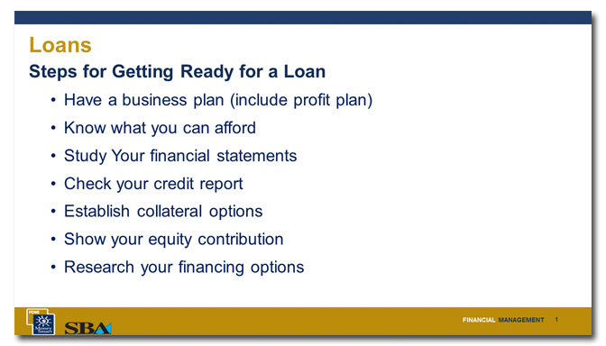
Before

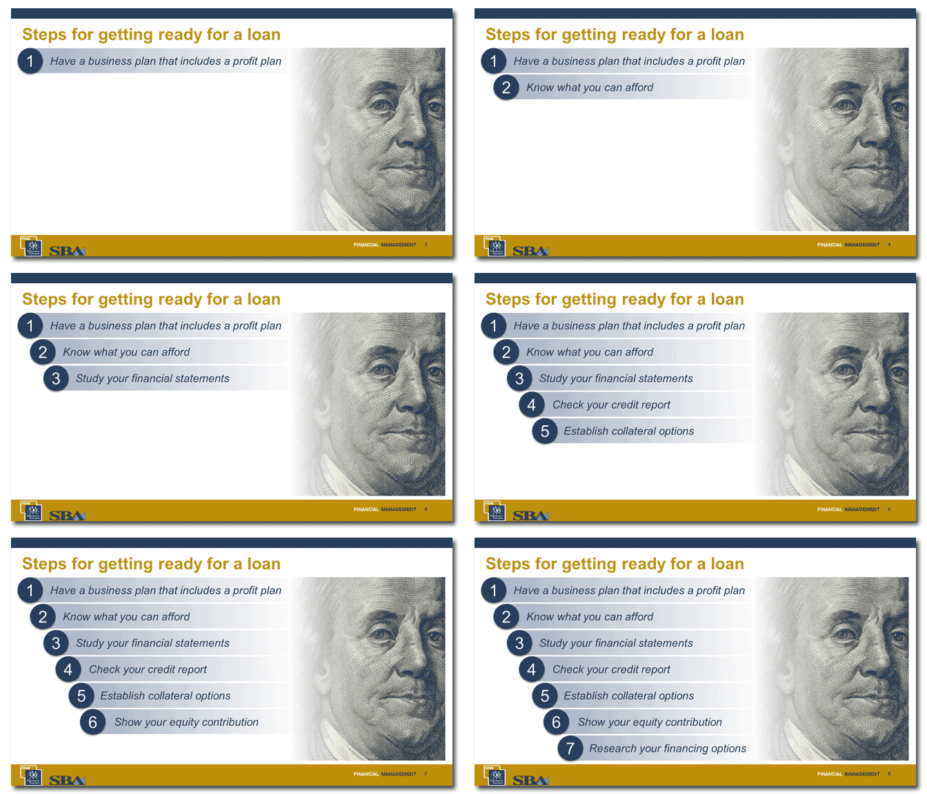
After

Problem 1
There are two titles on this slide, which is needlessly confusing.
Solution 1
I’ve changed the title from “Loans: Steps for getting ready for a loan” to “Steps for getting ready for a loan.”
Problem 2
There is way too much text on the slide and the lack of pictures makes it pretty plain.
Solution 2
I found an image of Ben Franklin from the US $100 bill in the public domain. It’s immediately recognizable, although it’s been cropped to both make it more interesting and to avoid unnecessary text on the slide. It’s an appropriate image, since the subject of the slide slide is money.
Problem 3
The way this information is presented—a text-only, everything-on-the-slide-at-once format—compels viewers to read the slide, which distracts them from the speaker. A slide like this makes the speaker lose control of the audience because they’re getting information as fast as they can read it, not at the pace the speaker sets. These steps could be very important to somebody and not following them could mean the difference between receiving needed capital and walking away empty-handed. So you’d want to make sure that the audience understands each step before proceeding to the next.
Solution 3
I’ve numbered the steps, given each one a simple graphic treatment and animated them so that they appear one at a time. Right now, you can see that it advances automatically. The speaker would advance through the steps only after thoroughly explaining each one.
[button link=”https://www.lauramfoley.com/gallery-2/” color=”orange” target=”_self” size=”small” title=”Back to Gallery”]Back to Gallery[/button]
[divider style=”shadow”]
Submit your own slide for a Makeover!
If you subscribe to the Cheating Death by PowerPoint newsletter you can receive a free Slide makeover! Here’s the deal: In exchange for permission to use your slide in the newsletter and on this website for promotional purposes, you’ll get the redesigned PowerPoint slide file to use in any way you like. So not only do you get access to a step-by-step video on how the slide was redesigned and the source file, you learn the reasons behind all of the changes!
You’ll also get a free eBook, Cheating Death by PowerPoint: Essential PowerPoint Tips, Tricks, and Best Practices, which includes loads of advice on how to improve the way you work with PowerPoint!
[button link=”https://list.robly.com/subscribe?a=c4115aa351a8e513f6e3b7af8ffaf943″ color=”default” target=”_blank” size=”small”]Subscribe to the Cheating Death by PowerPoint newsletter[/button]
[divider style=”shadow”]
[button link=”#top” color=”gray” target=”_self” size=”small” title=”Back to top”]Back to top[/button]

