Slide Makeover: Adding pizazz to trade show slides
Trade show slides are meant to attract casual strollers to your booth. So this is no place for black text on a white slide.
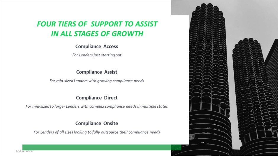
Before

This is what I like to call a “Just the facts, Ma’am” slide. All of the information is there, but visually it’s not very stimulating. This slide requires trade show attendees to stop and read it to get all the information they need. How many of them will invest the time to get the message?
After

Trade show slides are meant to attract attention, and nothing does that like movement, color, and photos. The product names come out one at a time, with colors that match their logos, and the photo and title slide in and out of frame. I’ve used a stock photo of people, rather than of an abandoned concrete building, which humanizes the message.
And compare the old title, “Four Tiers of Support to Assist in All Stages of Growth,” to the new title, “Supporting you at every stage.” The new title is brief and written in an active voice. It also focuses on the viewer and clearly sets up the value proposition for all four products.
The Takeaway
Trade show looping presentations are great fun to design because they’re meant to be flashy and full of movement. When you’re creating them, remember to think of them more as client magnets and less of a sleep aid.
