Don’t rotate text to fit into your graphics
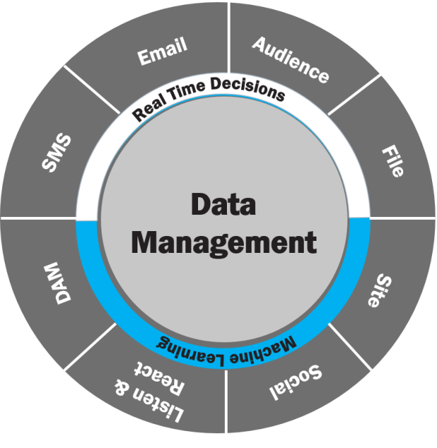
When designing a circular graphic, the temptation is there to rotate the text along the circle. Makes sense from an artistic perspective, but it makes your text practically impossible to read. By redesigning the graphic I maintain the sense that things are interrelated while making it less dense and easier to read.
Before

Problem 1
Text within the outer edge of the circle is rotated to match the arc of the circle, which makes it hard to read.
Problem 2
The blue area divides the circle in half visually. This implies that the text in the top half of the graphic (SMS, Email, Audience and File) relate to “Real-time Decisions” and that the text in the lower half of the graphic (Site, Social, Listen & React and DAM) relate to “Machine Learning.” But this isn’t the case; the color was just meant to separate “Real-time Decisions” from “Machine Learning.”
After

Solution 1
I redesigned the graphic so that each text block is now a circle. The connecting lines indicate that all of this text is related to and part of what’s going on in the inner circle. The result is that you still get the sense of a circle, but none of the text is rotated and it’s easy to read.
Solution 2
I moved “Real-time Decisions” and “Machine Learning” into the inner circle, thereby reducing the number of layers. I put blue shapes behind those phrases to differentiate them from the “Data Management.” Because the shapes have curved lines, they really fit into the circle well.
[button link=”https://www.lauramfoley.com/gallery-2/” color=”orange” target=”_self” size=”small” title=”Back to Gallery”]Back to Gallery[/button]
[divider style=”shadow”]
Submit your own slide for a Makeover!
If you subscribe to the Cheating Death by PowerPoint newsletter you can receive a free Slide makeover! Here’s the deal: In exchange for permission to use your slide in the newsletter and on this website for promotional purposes, you’ll get the redesigned PowerPoint slide file to use in any way you like. So not only do you get access to a step-by-step video on how the slide was redesigned and the source file, you learn the reasons behind all of the changes!
You’ll also get a free eBook, Cheating Death by PowerPoint: Essential PowerPoint Tips, Tricks, and Best Practices, which includes loads of advice on how to improve the way you work with PowerPoint!
[button link=”https://list.robly.com/subscribe?a=c4115aa351a8e513f6e3b7af8ffaf943″ color=”default” target=”_blank” size=”small”]Subscribe to the Cheating Death by PowerPoint newsletter[/button]
[divider style=”shadow”]
[button link=”#top” color=”gray” target=”_self” size=”small” title=”Back to top”]Back to top[/button]

