How many times have you seen a presentation where the speaker says, “Oh, I don’t know why these slides are here, you don’t have to read them.” Then they breeze through a bunch of slides until they’re back on track. What’s the point of that?
Before
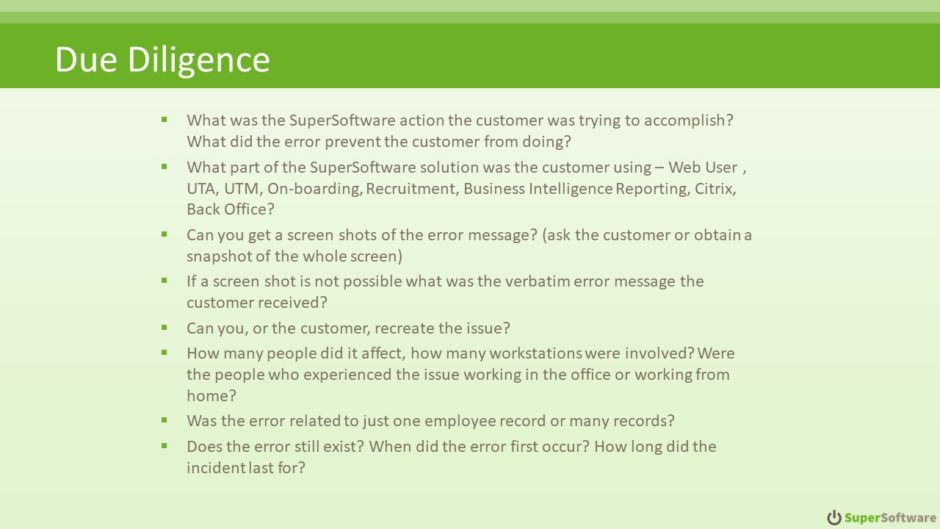
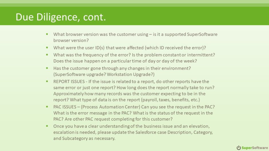
What’s better than a slide with so much text that it continues onto the next one? Almost anything! With so much text onscreen, the audience is left to either ignore it all to concentrate on the speaker, or ignore the speaker to concentrate on reading the slides.
After
When I analyzed these slides, I looked to the speaker notes for some guidance on what the speaker would actually talk about when these slides were onscreen. The answer was right there:
As an organization responsible for selling Software as a Service (SaaS), we need to ask the following business-related questions to help us determine the nature of the customer’s issues. Not every question is applicable to every case. The more information gathered the better.
Well, hush my mouth! All that text on the slide isn’t meant to be read after all! These slides are actually Eye Chart Slides, which means that it’s a bunch of text onscreen that is meant to be illustrative, not read. So here’s the redesigned slide:
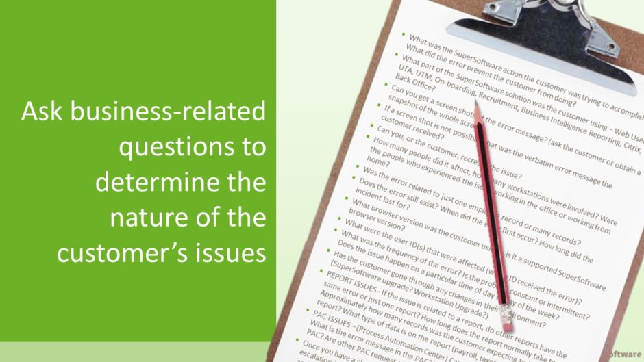
Now, all the text is part of an image. I put a pencil right on top of the text and made the image bleed off the slide to indicate that this text isn’t meant to be read.
If you wanted people to be able to see all of the possible questions they could ask, you could put these in the speaker notes then create an Amazingly Useful Handout.
The Takeaway
Every slide in your presentation should have a purpose. If you don’t want people to read or spend time thinking about a slide, then it shouldn’t be in the deck.