Themes should help, not hinder, slide design
A PowerPoint theme is supposed to help people to create new presentations that have a uniform look. A theme contains defaults for typefaces, colors, formatting, and layouts to make it easy for people to use. But what often happens is that this get mixed up if presentations are created by combining slides from a variety of sources.
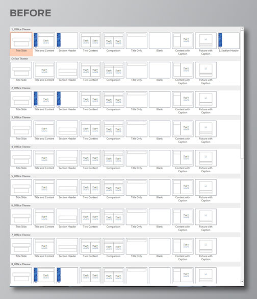
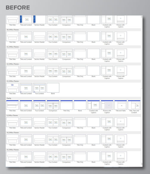
The Optical Society of America, or OSA, approached me to redesign their PowerPoint theme. The pictures above show that their original presentation had no fewer than 17 masters! No wonder their presentations didn’t look unified! I needed to drastically reduce the number of choices while still making a usable theme that allowed for slide variety.
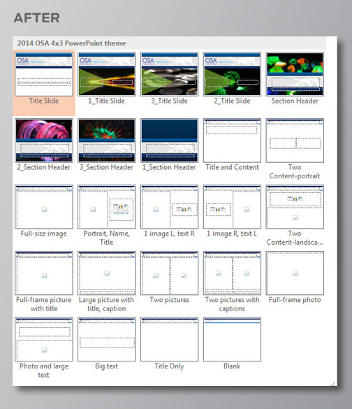
Here is the new theme. There are a total of 24 layouts that allow for many text and image combinations. Users have a choice of four title slides and 4 section headers, all of which look good when used together. The number of available layouts also reduces the need for users to create their own, which makes slides easier to update later on if the theme ever gets redesigned.