Too much text on a slide is no fun for an audience to read. And if they’re busy reading your slides, they won’t be paying attention to you.
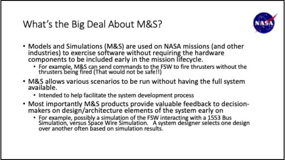
Before: Bullet points help me to organize my information

Oh my goodness, that’s a lot of reading the presenter is forcing on the audience! With the type being pretty much the same size, weight, and color, it all blends together to form a solid wall of words.
After: Let’s focus on benefits

I tweaked the title by spelling out “Modeling and Simulation” so the audience wouldn’t suffer from Acronym Overload™. I also found a photo that shows NASA engineers in an M&S lab. Thanks, Internet!
Next, I determined what the main benefits of M&S are based on what was on the slide and called each one out in a colored bar on the right. The bars are animated to come in on clicks, so the presenter can control the speed of the information. The most important benefit comes in last and is highlighted with a bright red box and larger type. All of the information that was on the original slide goes into the notes section and is addressed by the speaker.
The Takeaway
Don’t make the audience work to understand what you’re telling them. A presentation shouldn’t be a recitation of your slides or an opportunity for people to practice their reading skills. Slides are a visual medium, so make the most of them!
