Objects on your slides can communicate just as much (and often more) than text. So don’t send mixed messages with weird shapes and random font sizes!
Before
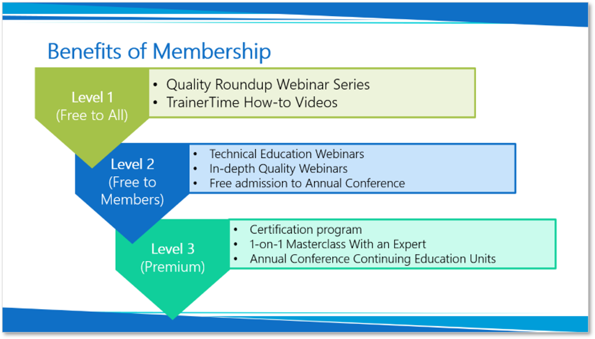
This slide shows three membership levels for an organization. The text and colors are mostly fine, but the shapes and sizes are weird and confusing:
- Level 1, which is free, appears to be the most important because it’s at the top of the slide and it overlaps the shapes below. Why would you want to promote free membership if the goal is to attract paying members?
- The Level 1 bullet point text is larger than that of Levels 2 and 3. Again, this makes it seem most important.
- Why do the Levels look like they’re written on home plate? (For my international and/or non-sports-inclined readers, “home plate” is where a baseball player stands as the pitcher is throwing the ball for him to hit.) This presentation has nothing to do with baseball, yet that shape is heavily associated with the game.
Another thing I noticed is that this slide is static, so all of the information appears at once. While the presenter is talking about Level 1, the audience is free to become distracted by reading ahead. Not such a good thing.
After
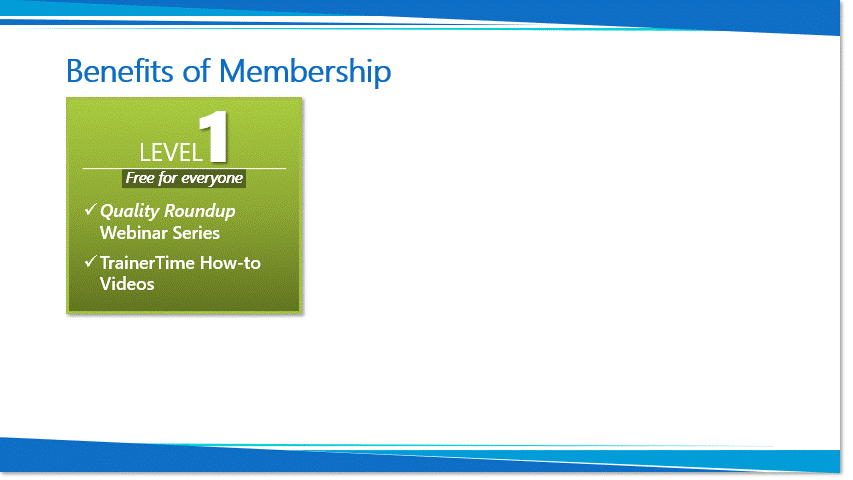
In the redesigned slide, I got rid of the “home plate with a flag coming off it” shapes and went with simple boxes for each membership level. Here are the other changes I made:
- While the image above is on a loop, the actual slide animations are triggered with clicks. That means that we don’t see information about Levels 2 and 3 until the presenter wants us to.
- I changed the bullet points to check marks to affirm that these benefits are included at each level.
- I changed Level 2 from “free to members” to “Members Only” to make it seem more exclusive and, therefore, desirable.
- I added “All Level X Resources, plus…” text on the Level 2 and 3 boxes. This makes it clear that the higher your membership level, the more you receive.
- The Level 2 box is bigger than the Level 1 box, and the Level 3 box is the biggest of all. The visual effect is that the higher the level, the better it is.
- The Level 3 description is bigger than the descriptions for Levels 1 and 2. Again, visually bigger is better.
The Takeaway
By managing the shapes and sizes of objects on your slides, you control the flow of information and offer nonverbal cues as to the relative importance (and desirability) of what you’re showing the audience.