It’s good to use pictures in your PowerPoint presentations. But make sure you use the right ones, or you’ll confuse your audience.
Before
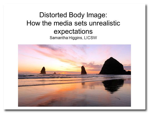
This title slide introduces a presentation about the media’s portrayal of “ideal” bodies. But this slide isn’t getting me jazzed up about the presentation or making me care about the problem at all.
From the wording of the title, we can guess that the presenter has very strong feelings on the subject. But the plain vanilla typography is dull and uninspired. Centered black Arial? Please…
While usually I like plain white backgrounds on slides, it’s not working here. I think mainly it’s because there are uneven margins around the photo, so the slide looks imbalanced.
And what’s up with that picture? Maybe the presenter happens to like sunsets on the beach, but that kind of stuff belongs in a personal ad, not in a deck that deals with such serious subject matter! It’s almost as if the picture’s making fun of the topic.
After
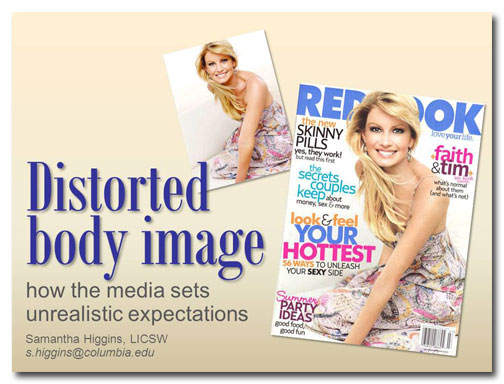
In 2007, an article was posted on the feminist blog Jezebel featuring a side-by-side comparison of this unretouched photograph of country artist Faith Hill and the heavily Photoshopped image that was used for the Redbook cover. Since this revelation created quite a controversy and provoked a lot of discussion on image manipulation, these photographs are a perfect fit for our title slide. I’ve rotated the images and made them different sizes both to add visual interest and so they would both fit on the slide.
The headline typeface, Bodoni MT Condensed, is similar to that used on the covers of Elle and Vogue, two popular fashion magazines. I’ve varied the colors, typefaces, and type size to set the hierarchy of information (i.e., the headline’s big and bold, the subtitle’s midsized, and the presenter’s information is small). I’ve also added some contact information for the presenter.
The background is now the same color as the kind of concealer a light-skinned woman might use to hide perceived imperfections in her skin. “Makeover of the month,” geddit?
[button link=”https://www.lauramfoley.com/gallery-2/” color=”orange” target=”_self” size=”small” title=”Back to Gallery”]Back to Gallery[/button]
[divider style=”shadow”]
Submit your own slide for a Makeover!
If you subscribe to the Cheating Death by PowerPoint newsletter you can receive a free Slide makeover! Here’s the deal: In exchange for permission to use your slide in the newsletter and on this website for promotional purposes, you’ll get the redesigned PowerPoint slide file to use in any way you like. So not only do you get access to a step-by-step video on how the slide was redesigned and the source file, you learn the reasons behind all of the changes!
You’ll also get a free eBook, Cheating Death by PowerPoint: Essential PowerPoint Tips, Tricks, and Best Practices, which includes loads of advice on how to improve the way you work with PowerPoint!
[button link=”https://list.robly.com/subscribe?a=c4115aa351a8e513f6e3b7af8ffaf943″ color=”default” target=”_blank” size=”small”]Subscribe to the Cheating Death by PowerPoint newsletter[/button]
[divider style=”shadow”]
[button link=”#top” color=”gray” target=”_self” size=”small” title=”Back to top”]Back to top[/button]


