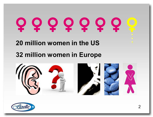
A slide about…well…you know.
This slide comes from Design Dispatch subscriber Dr. Jerrold Shapiro of Fem-Medical LLC. His company has developed a nonsurgical treatment for female incontinence that he’s trying to get on the market and this slide is from his pitch deck.
Before
The pink female symbols appear first, followed by the last yellow one, to illustrate that 1 out of 8 women suffer from incontinence. This is a sobering statistic, but the final image is a bit too literal.
The next thing that appears are the numbers of affected women. These numbers are staggering, yet the font size is relatively small compared to the other graphics on the slide so they don’t stand out much.
The last set of images comes in a couple at a time, each with a different style of animation. The first three images illustrate that incontinence is a problem that people seldom talk about. The Viagra is there because Dr. Shapiro points out that when a man has a problem in the pelvic area it’s not only discussed openly but there are several products on the market that mitigate it. The last image obviously shows a woman in distress. These images are well-chosen for this presentation, but since the styles are all different they don’t look good when shown as a group. Also, the different types of animation used for each image is distracting.
Dr. Shapiro has also put his logo on the slide, which takes up a fair amount of space, and a large slide number, which I talk about a blog article charmingly titled “Slide numbering in PowerPoint is stupid. Discuss.” I’ll remove both of these in the redesigned slide.
After
For the redesigned slide, I chose to keep just the female symbols along the top of the slide, the image of the woman in distress, and the statistics. This gives the slide more impact, and the numbers stay on the screen while Dr. Shapiro talks about the disparity in male and female treatments.
[button link=”https://www.lauramfoley.com/gallery-2/” color=”orange” target=”_self” size=”small” title=”Back to Gallery”]Back to Gallery[/button]
[divider style=”shadow”]
Submit your own slide for a Makeover!
If you subscribe to the Cheating Death by PowerPoint newsletter you can receive a free Slide makeover! Here’s the deal: In exchange for permission to use your slide in the newsletter and on this website for promotional purposes, you’ll get the redesigned PowerPoint slide file to use in any way you like. So not only do you get access to a step-by-step video on how the slide was redesigned and the source file, you learn the reasons behind all of the changes!
You’ll also get a free eBook, Cheating Death by PowerPoint: Essential PowerPoint Tips, Tricks, and Best Practices, which includes loads of advice on how to improve the way you work with PowerPoint!
[button link=”https://list.robly.com/subscribe?a=c4115aa351a8e513f6e3b7af8ffaf943″ color=”default” target=”_blank” size=”small”]Subscribe to the Cheating Death by PowerPoint newsletter[/button]
[divider style=”shadow”]
[button link=”#top” color=”gray” target=”_self” size=”small” title=”Back to top”]Back to top[/button]


