What’s a SPaDDIE?
This slide comes from Design Dispatch subscriber Jim Rich. His presentation introduces a set of six performance improvement standards for his industry that’s a shortened form of the ten standards that are commonly used.
At first, Jim requested that I make over a slide that shows the ten standards to make it easier to read. He told me that it was important that all of the standards appear on a single slide, so I couldn’t break it across multiple slides as I’d wanted to. I dug a little deeper into the project, trying to find ways to abbreviate the standards to reduce the amount of words on the slide. I presented my findings to Jim, who then sent me the entire deck so that I could see how the slide looked in relation to the others.
Surprisingly, in the context of the entire deck, it was better to leave this slide as it was — wordy and unattractive — because the whole point of his presentation is that his six standards are easier to remember and accomplish the same thing as the ten standards. So we decided instead to redesign the slide that shows his six standards.
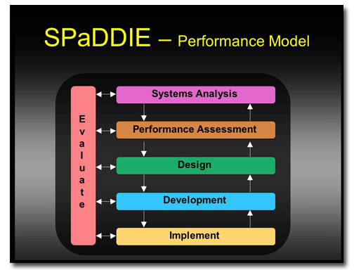
Before
 The first thing I wanted to change about this slide was the colors of the boxes in the diagram. I could see that he was trying to differentiate the steps, but the colors seemed too bright and varied to be a part of a corporate presentation. Besides, they weren’t the colors assigned to the template.
The yellow title and the graduated black background with the uneven black border was very distracting to me. Changing these would allow people to focus their attention on the diagram.
Finally, the arrows in the diagram are confusing. The SPaDDIE Performance Model is a cycle that starts at Systems Analysis and ends at Implement, with continuous Evaluation all the while. But this diagram indicates that one could cycle between any contiguous steps, such as Design and Development, without advancing on to the next step.
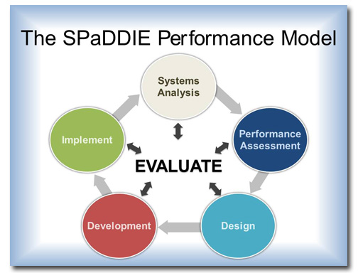
After
Since this is a cycle, the obvious solution was to arrange the elements into a circle. And because it’s important to Evaluate at every part in the process, that step goes in the middle. I also lightened the background and changed the wording and color of the headline.
[button link=”https://www.lauramfoley.com/gallery-2/” color=”orange” target=”_self” size=”small” title=”Back to Gallery”]Back to Gallery[/button]
[divider style=”shadow”]
Submit your own slide for a Makeover!
If you subscribe to the Cheating Death by PowerPoint newsletter you can receive a free Slide makeover! Here’s the deal: In exchange for permission to use your slide in the newsletter and on this website for promotional purposes, you’ll get the redesigned PowerPoint slide file to use in any way you like. So not only do you get access to a step-by-step video on how the slide was redesigned and the source file, you learn the reasons behind all of the changes!
You’ll also get a free eBook, Cheating Death by PowerPoint: Essential PowerPoint Tips, Tricks, and Best Practices, which includes loads of advice on how to improve the way you work with PowerPoint!
[button link=”https://list.robly.com/subscribe?a=c4115aa351a8e513f6e3b7af8ffaf943″ color=”default” target=”_blank” size=”small”]Subscribe to the Cheating Death by PowerPoint newsletter[/button]
[divider style=”shadow”]
[button link=”#top” color=”gray” target=”_self” size=”small” title=”Back to top”]Back to top[/button]


