I like pie, but…
Today’s slide makeover was inspired by Dr. James Smith, a man who teaches people in health care organizations how to use data more effectively.
The visual representation of statistics has always been a contentious issue. The classic book How to Lie with Statistics offers numerous examples of how the same data can be displayed in several different ways depending upon the conclusions you want the viewer to reach.
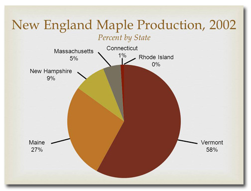
Dr. Smith took me to school the other day after watching a Brainshark I’d made, Graphs as Infographics. Although he praised my redesign of a pie chart (When I construct a pie chart I always make sure that the data are in descending order, with the largest number first and the smallest number last. This creates wedges that diminish in size as you move clockwise around the chart.), he pointed out that it’s difficult to make data comparisons in what he terms “a circular table.” A better visual representation of comparative data, he said, was a bar chart.
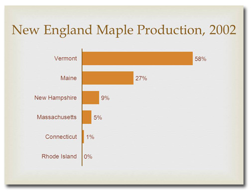
By gum, he was right. So for this month’s slide makeover you’ll learn that a bar chart is far more effective for making data comparisons than a pie chart.
Before
 It’s obvious that one New England state dominates in maple syrup production, but it isn’t clear which one until you read the tiny callout. The subtitle on this slide is redundant, since by its nature a pie chart shows percentages. And because Rhode Island doesn’t produce maple syrup it gets a 0%, which cannot be represented visually in a pie chart; one has to read the callout to even realize this figure is represented.
After
Redesigned as a bar chart, it’s immediately apparent to the most casual observer that Vermont leads in maple syrup production while little Rhode Island comes in last. We don’t need to include the subtitle anymore because the data labels are marked with a percentage sign. These data labels also eliminate the need for a horizontal axis.
[button link=”https://www.lauramfoley.com/gallery-2/” color=”orange” target=”_self” size=”small” title=”Back to Gallery”]Back to Gallery[/button]
[divider style=”shadow”]
Submit your own slide for a Makeover!
If you subscribe to the Cheating Death by PowerPoint newsletter you can receive a free Slide makeover! Here’s the deal: In exchange for permission to use your slide in the newsletter and on this website for promotional purposes, you’ll get the redesigned PowerPoint slide file to use in any way you like. So not only do you get access to a step-by-step video on how the slide was redesigned and the source file, you learn the reasons behind all of the changes!
You’ll also get a free eBook, Cheating Death by PowerPoint: Essential PowerPoint Tips, Tricks, and Best Practices, which includes loads of advice on how to improve the way you work with PowerPoint!
[button link=”https://list.robly.com/subscribe?a=c4115aa351a8e513f6e3b7af8ffaf943″ color=”default” target=”_blank” size=”small”]Subscribe to the Cheating Death by PowerPoint newsletter[/button]
[divider style=”shadow”]
[button link=”#top” color=”gray” target=”_self” size=”small” title=”Back to top”]Back to top[/button]


