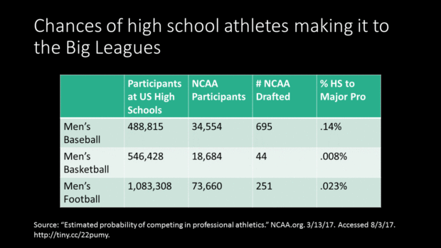
Statistics. Big yawn, right? They can be if they’re presented as a table. But there’s a way to transform dry statistics into relatable numbers while adding excitement and drama to the slides.
Before

Problem 1: My brain hurts!
We’re being presented with a lot of numbers here and I have to read each line to make sense of them. And what exactly is .008% of something? I can’t relate to a weird percentage like that. Can you? What we need is a means of expressing the percentage in a way that people can understand.
Problem 2: No pictures
Even statisticians like to see pretty images once in a while. And the right images would reduce the amount of reading necessary. You know, that whole “A picture’s worth a thousand words” thing.
After

Solution 1: Change percentages into odds ratios
To do this, I went to the Odds Conversion Calculator. Using this tool, I determined that .14% means 1 in 713; .008% means 1 in 12,499; and .023% means 1 in 4,347. These numbers are a lot more relatable!
Solution 2: Added photos and animation
I added photos of the sports being referenced in the text to add some color and visual interest to the slides. I’ve automated the animation so you can see it, but in the actual presentation the odds are revealed on a click. This gives the presenter an opportunity to add drama by making the audience wait for the answer. The presenter could also encourage audience participation by asking people what they think the odds are.
In conclusion…
Statistics are as boring as you allow them to be. If you are using statistics to make a point, be sure to present them in a way that make sense to the audience!
[button link=”https://www.lauramfoley.com/gallery-2/” color=”orange” target=”_self” size=”small” title=”Back to Gallery”]Back to Gallery[/button]
[divider style=”shadow”]
Submit your own slide for a Makeover!
If you subscribe to the Cheating Death by PowerPoint newsletter you can receive a free Slide makeover! Here’s the deal: In exchange for permission to use your slide in the newsletter and on this website for promotional purposes, you’ll get the redesigned PowerPoint slide file to use in any way you like. So not only do you get access to a step-by-step video on how the slide was redesigned and the source file, you learn the reasons behind all of the changes!
You’ll also get a free eBook, Cheating Death by PowerPoint: Essential PowerPoint Tips, Tricks, and Best Practices, which includes loads of advice on how to improve the way you work with PowerPoint!
[button link=”https://list.robly.com/subscribe?a=c4115aa351a8e513f6e3b7af8ffaf943″ color=”default” target=”_blank” size=”small”]Subscribe to the Cheating Death by PowerPoint newsletter[/button]
[divider style=”shadow”]
[button link=”#top” color=”gray” target=”_self” size=”small” title=”Back to top”]Back to top[/button]

